
Proof of Concept: Designing & Testing Expedition-Related Postal Artifacts

NOTE: A version of this article now appears in the April 2026 edition of Ice Cap News, the official journal of the American Society of Polar Philatelists.
ABSTRACT
This article presents training expedition covers as proof-of-concept artifacts designed to refine philatelic methods in advance of a polar expedition. Produced during field training on Kelleys Island, these covers document research activities while testing strategies for integrating philatelic practice into expedition routines. Their design draws on influences from historical polar covers while introducing new elements, including contextual inscriptions, in-field customization, and narrative emblems that link each cover to broader research projects. By ensuring that each piece carries both provenance and story, these covers serve as communicative objects for collectors, future researchers, and non-specialist audiences alike. The project demonstrates how training covers can expand the scope of polar philately, bridging archival record-keeping, artistic practice, and expeditionary communication, while preparing the foundation for covers to be produced during the forthcoming Baffin Island expedition.
Keywords: Polar philately, training expedition covers, philatelic design, expedition communication, narrative artifacts, in-field customization, provenance in philately, philatelic outreach
UNDER THE INFLUENCE
I began to produce a series of covers documenting my activities during my expedition training activities on a local island, both to refine the process and also to develop the professional habit of integrating philatelic considerations into my anticipated expedition activities. I wanted it to become a natural habit, so that when I am otherwise distracted during an expedition, I can easily continue to post covers from muscle memory if nothing else.
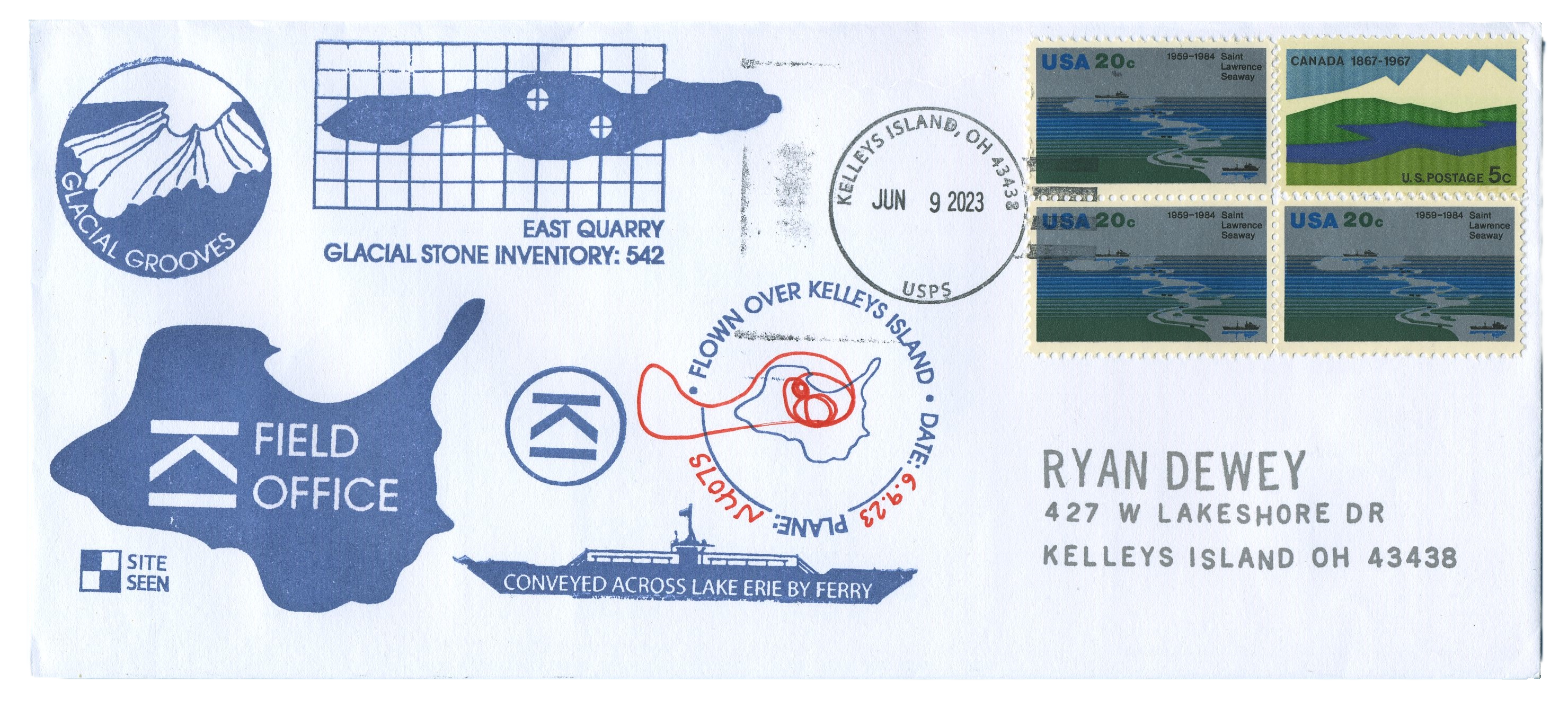
In this article I will trace the design decisions back to the covers that influenced me, but first, let’s look at the main cachet produced by my training expedition:
The back markings on my covers include a hand-inked designation of this posting as a “TRAINING EXPEDITION” across the middle of the top flap, a stacked web address in the lower right corner which recipients can use to access expanded details of the project, and an off-set description of the overall project stretched along the bottom flap.
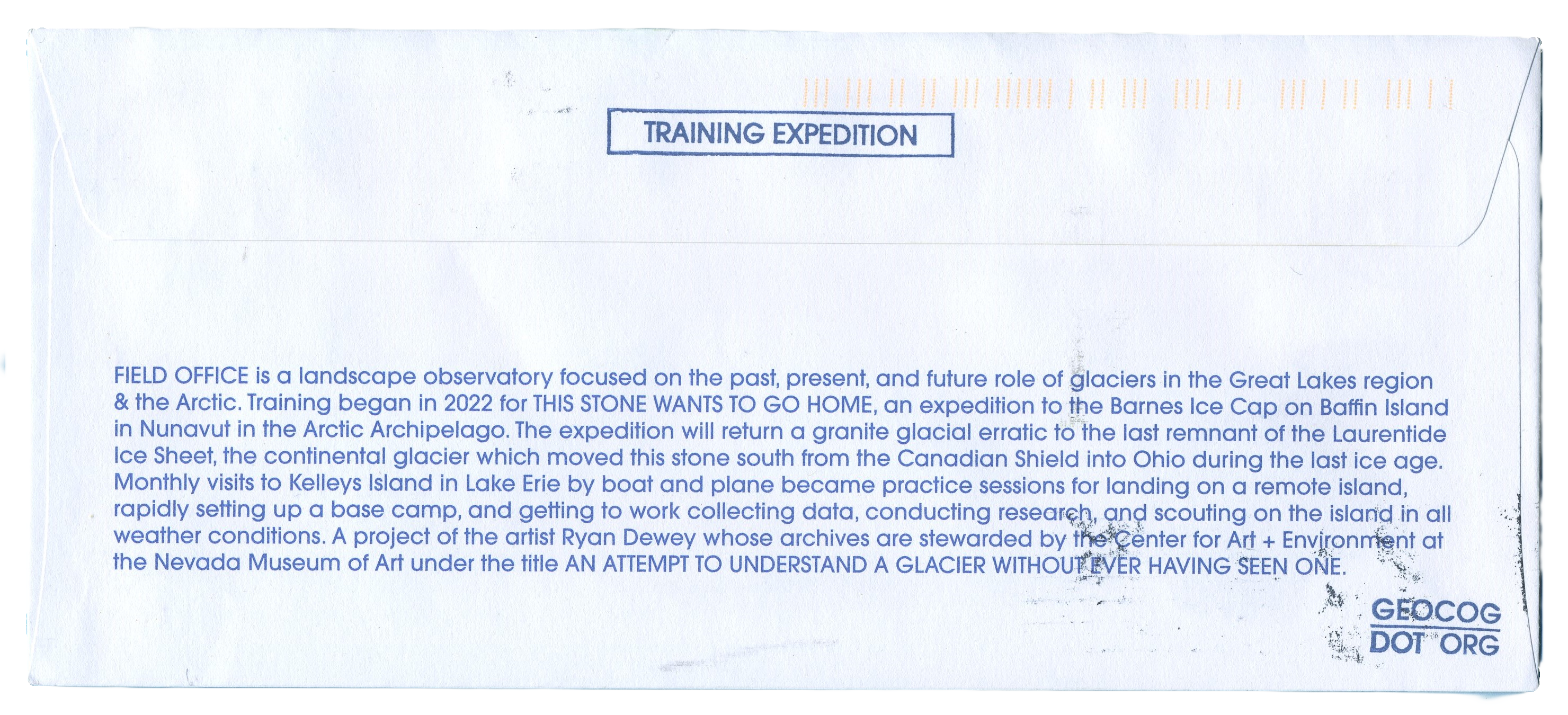
The back text description resulted from my frustration with some of the covers I’ve collected. In some cases there is no discoverable information about the expeditions they represent other than the clues in the transit markings and other philatelic facts present on the cover. I’ve often wanted to know more about the expedition, so I dig for details, but come up empty-handed. I made the design decision that my cover should give enough information to contextualize the activities graphically depicted on the cover to provide a self-contained story while simultaneously providing sufficient provenance information to point collectors to the permanent custodial source for more information about the expedition (e.g., my archive record at the Nevada Museum of Art).
This text enables the transfer of a complete story about the cover as it passes hands from one collector to the next in the secondary market. It reads:
“FIELD OFFICE is a landscape observatory focused on the past, present, and future role of glaciers in the Great Lakes region & the Arctic. Training began in 2022 for THIS STONE WANTS TO GO HOME, an expedition to the Barnes Ice Cap on Baffin Island in Nunavut in the Arctic Archipelago. The expedition will return a granite glacial erratic to the last remnant of the Laurentide Ice Sheet, the continental glacier which moved this stone south from the Canadian Shield into Ohio during the last ice age. Monthly visits to Kelleys Island in Lake Erie by boat and plane became practice sessions for landing on a remote island, rapidly setting up a base camp, and getting to work collecting data, conducting research, and scouting on the island in all weather conditions. A project of the artist Ryan Dewey whose archives are stewarded by the Center for Art + Environment at the Nevada Museum of Art under the title AN ATTEMPT TO UNDERSTAND A GLACIER WITHOUT EVER HAVING SEEN ONE.”
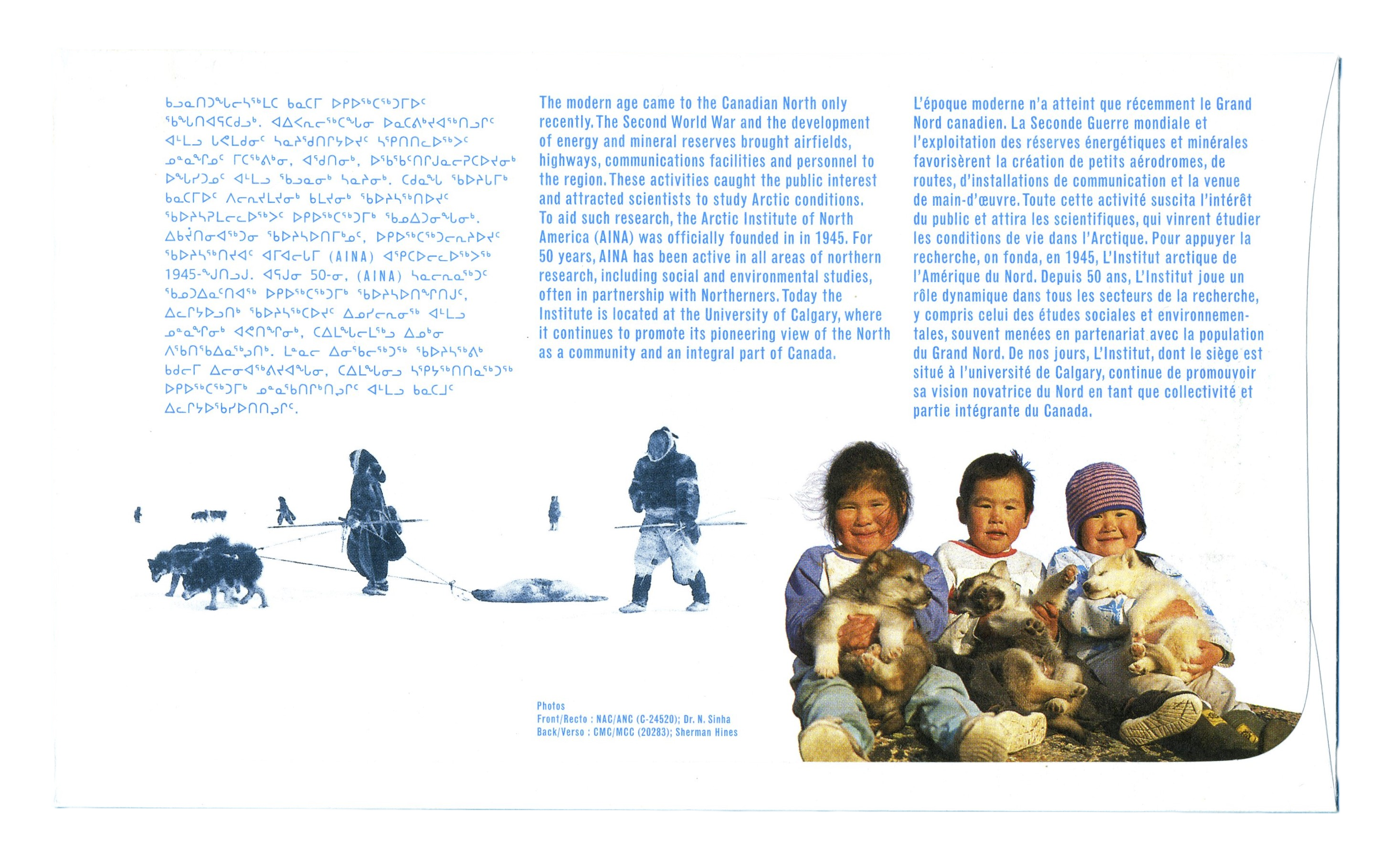
This should be enough information for curious philatelists a century from now to dig up the historical facts of the expedition, should someone be curious. One cachet from my collection (AINA Day of Issue 1995) has a similar type of contextualizing description printed in three languages on the back (Inuktitut, English, & French).
While I like the use of the off-set printing for text blocks, for imagery I prefer the ink stamp, and I did not want the iconographic elements to be printed onto the cover. The precision gained by printing helps keep order to the complexity of imagery elements, but it comes at the expense of neglecting the human hand.
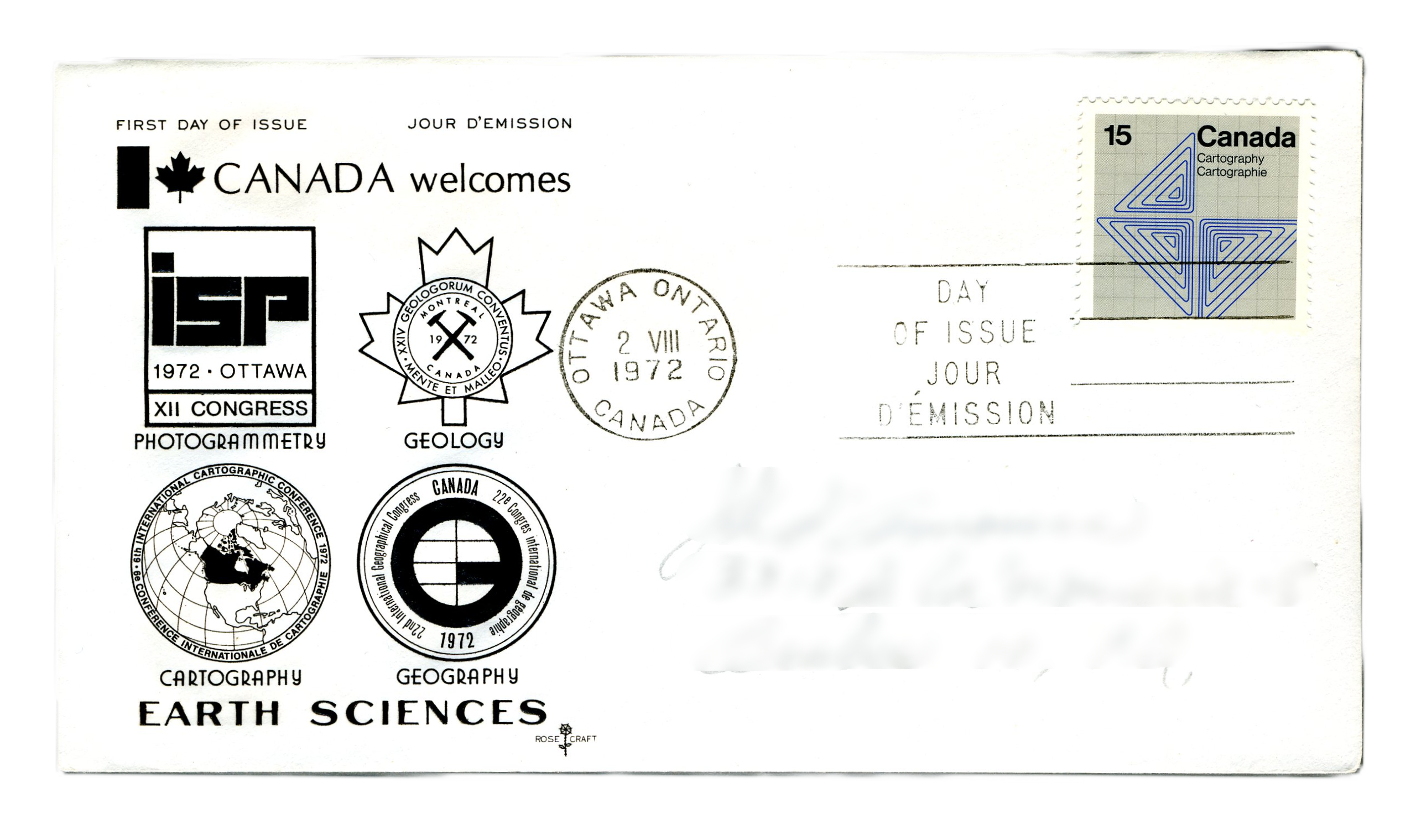
Consider how this “Canada Welcomes Earth Sciences” cover from 1972 depicts thematically related research disciplines in an orderly grid. While visually appealing, there is sterility in this cover that I don’t think helps tell the story that I intend my event covers to convey. So to avoid this, the front markings on my training cover are all hand stamped with archival ink on custom cut mats with designs to commemorate expedition research, route details, and milestones.
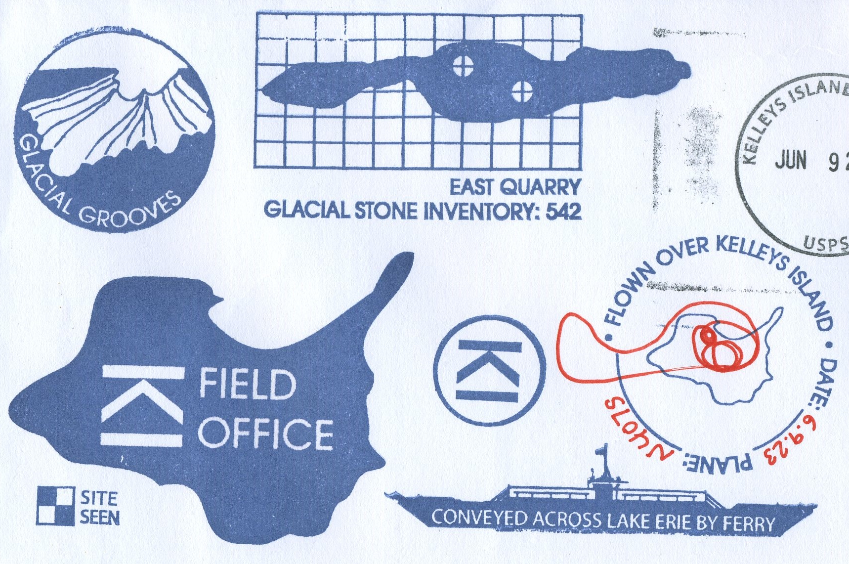
The front markings are a series of iconographic emblems of the activities of the expedition. Starting from the top left, a circular emblem reading “GLACIAL GROOVES” depicts a series of glacially-carved grooves in limestone (a significant geologic feature of the island), and is part of a photogrammetry mapping project I undertook in 2023 to build a navigable 3D model of the grooves.
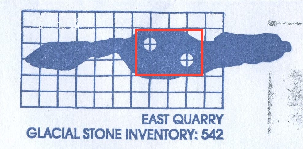
To the right of the grooves emblem is a grid overlay on the shape of East Quarry, a location on the island that I extensively mapped during my successive training sessions. The grid and double circle reticles denote a pin-pointing of sites within the quarry, and the emblem as a whole is labeled with the text “EAST QUARRY GLACIAL STONE INVENTORY: 542” — the result of the first round of mapping the quarry, which was to locate and photograph every glacially-transported stone that was found within the bounds of the quarry.
A similar double circle inside the outline of a form adorns the front of this Resolute Bay cover, where the eye of the seal depicts a sun icon and the moon icon is depicted inside the tail flippers. The amorphous quarry perimeter in my training cover and the abstract seal outline in the Resolute Bay cover both feature double circles inside the outline of a form, relating the form to the meaning of the contained items. Both share a formal nesting relationship that semiotically links the contained to the form of the container.
Centered below these two emblems is the outline of Kelleys Island where I’ve taken the initials of the island KI and rotated them clockwise by 90 degrees, resulting in a stack of letters that resemble a rank insignia, placed next to the words “FIELD OFFICE” the registered legal name of my expeditionary platform. The image of the island is oriented as it lays on the coordinate grid in an absolute frame of reference. Off the southwestern shore of this image, a smaller emblem with a four-block grid and the words “SITE SEEN” connect this cover and the depicted activities with a Great Lakes mapping project of the same name that my studio conducts on an ongoing basis. The SITE SEEN project records findings through dispatches of postcards that feature form fields, check-boxes, sketches and maps to record coordinates and details of each foray (to be completed in-field), which I will describe in another article on postcards.
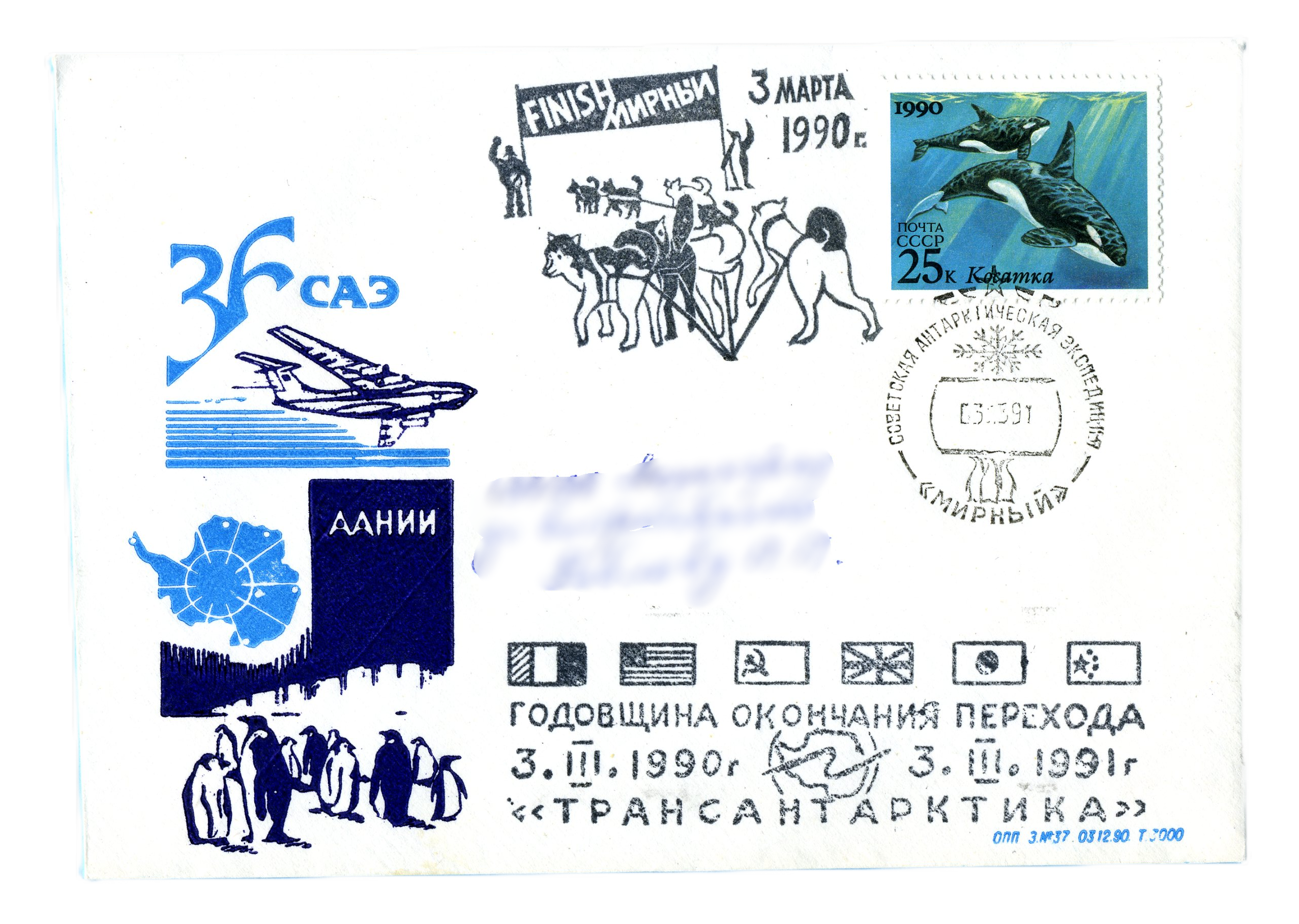
The the earliest covers to enter my collection was this Russian Antarctica cachet, and I was drawn to it for the color and layout of the front elements. My outline map of Kelleys Island reminds me of the image of Antarctica on this cover. The sequence of abstracted country flags set in a line, but askew, give the image a sense of the human hand, instead of a letterpress or off-set printing of details on the cover. My SITE SEEN emblem has a similar form as the flags on this cover. I wouldn’t say that the influence this cover has on my work is a direct mapping of element to element, but the influence could be described as more of a vibe than a mapping. The cohesion across the colors, the obvious hand application, the attempts to use design to tell a story. Maybe I’m including it here because it makes me happy to look at it, but it’s been an inspiration as an aspirational piece.
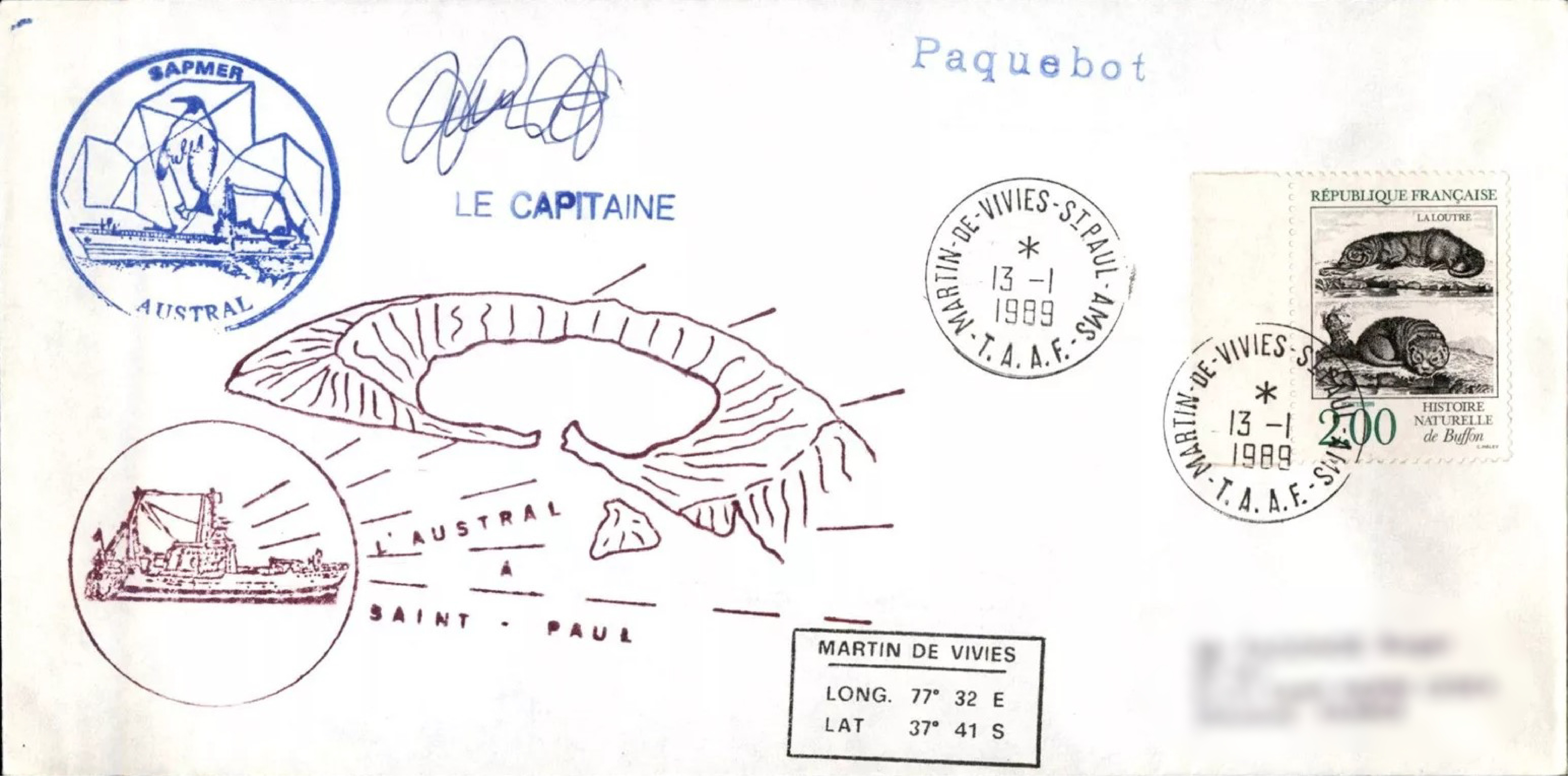
Approaching the island from the eastern shore is the outline of one of the vessels of the island ferry service, with text in negative field reading “CONVEYED ACROSS LAKE ERIE BY FERRY.” This emblem sits between the address and the island. There is a spatial relationship between the vessel and the rendering of the island that I’ve seen in several covers. My favorite example of juxtaposition denoting maritime spatial proximity is this Martin-de-Vivies & St Paul 1989 cover where the French fishing vessel AUSTRAL is positioned adjacent to the outline of St Paul, and the vessel faces the island on the approach with radiating lines of visual prospect cast onto the island denoting arrival on the island. [Note: the current fishing vessel Austral (IMO: 9039262, built 1993) is not the same vessel depicted on this cover which is actually the Pierre Pleven built in 1966, purchased by SAPMER in 1980 (Bateaux de Saint-Malo) at which time it was renamed to Austral as depicted on the 1983 French Southern & Antarctic Territory Scott #103.]
Above the ship is the only frivolous inked marking on the cover, a circled “KI” rotated 90 degrees and inside a thick lined circle, a design influenced by the tax-stamp circled “T” emblem.
Bow and stern on a ferry aren’t always obvious, but above the stern in my depiction of the ferry is an inked, fillable form-field circling an outline of Kelleys Island with the words “FLOWN OVER KELLEYS ISLAND” and “DATE:_____” and “PLANE:______” atop which is hand-drawn in red ink the complete flight path originating from the island, circling sites on the island, and returning to the airstrip on the eastern shore of the island. The date and tail number of the plane are written in red as well.
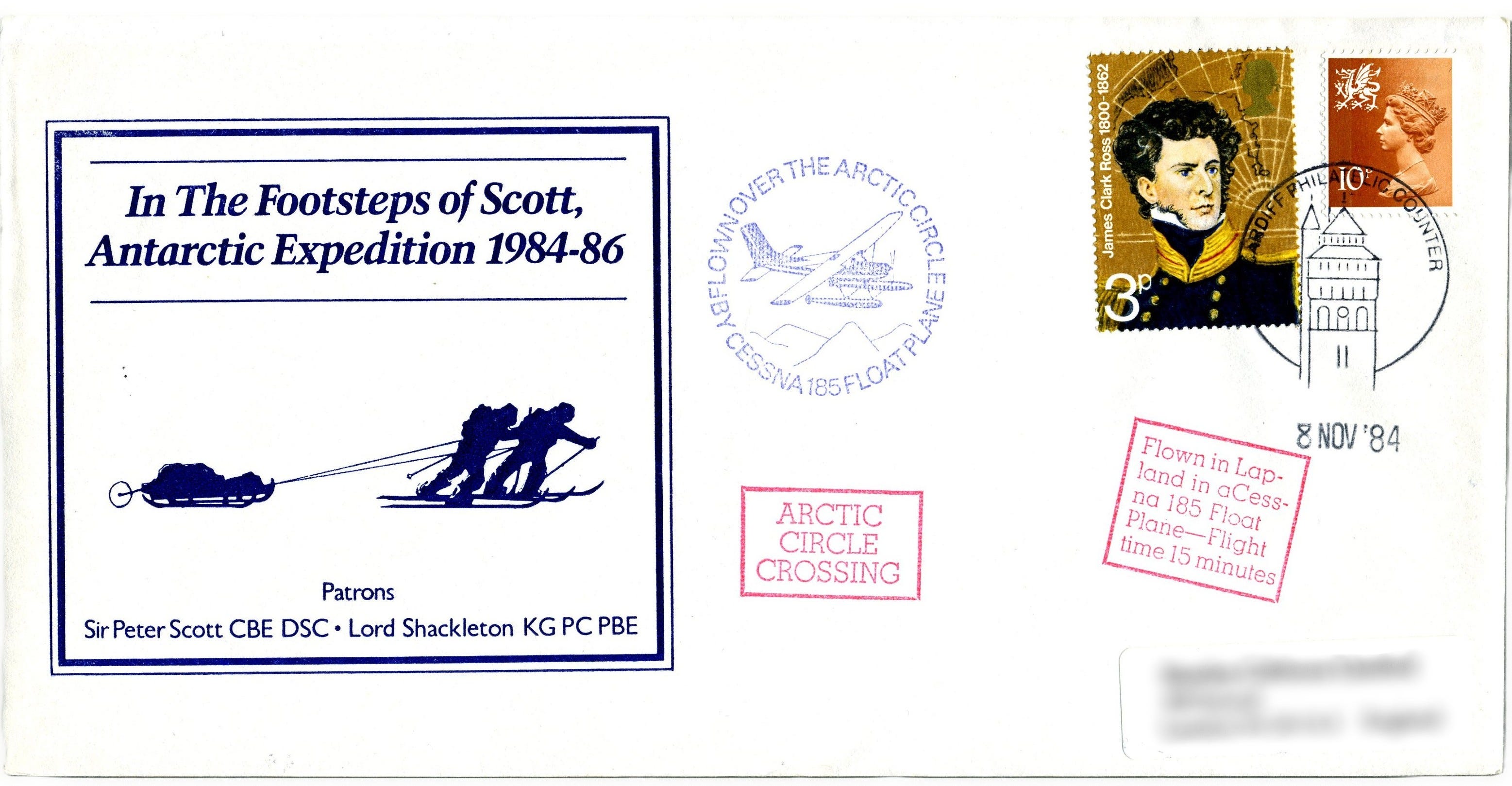
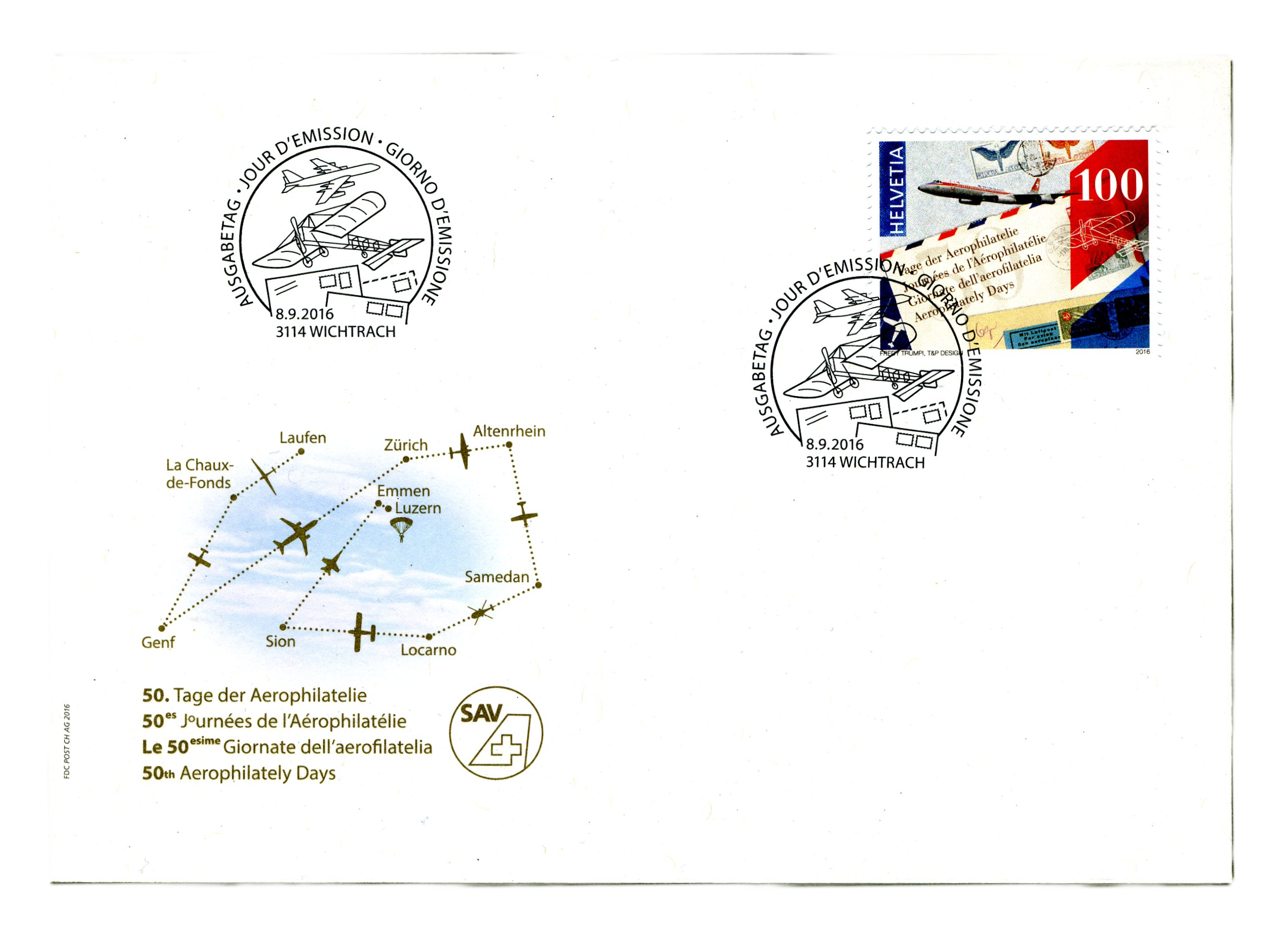
The concept of including flight information in a fillable form template stamp occurs on several covers in my collection, but the example I like best is this 1972 Polar Quest cover. In addition to the robust form field for ink pen edits with coordinates, date, personnel, there is additional information about the transport written beneath, providing a rich detailed description of the journey. Other inspirational covers that are marked as being carried on flights include this In The Footsteps of Scott, Antarctic Expedition 1984-86, with “FLOWN OVER THE ARCTIC CIRCLE BY CESSNA 185 FLOAT PLANE” seal with drawing of plane inside. And, while not a polar cover, this Swiss first day Aerophilately Days cover from 2016 has a flight plan traced out city-to-city depicting the different modes of air travel. The flight path depiction is generalized, but provides a view of the itinerary that helps imagine the journey. I wanted to fold in the flight path in my emblem, so I drew in the path shape of the flight trajectory. Like a signature on the front of a cover, these hand-drawn elements expand the story with an artifact of the journey imbuing a level of authenticity to the cover.
SOURCE & DESTINATION
The addressee for all 101 covers in this mailing was general delivery to myself on the island. None of these covers were hand-back service; they all entered circulation, and were collected during my next trip to the island. The result of this mailing was a collection of 101 examples of USPS mail handling which reads like a corpus of automated sorting mistakes. Considering the USPS Postal Operations Manual (POM) chapter 2 outlines their commitment to handling philatelic items with care which my covers did not receive, I took it up to analyze this corpus forensically and produced a comprehensive map of the processing errors and handling decisions which I will explore in another article.
POSTAGE DECISIONS
The postage used for my training covers intentionally coordinated with vintage topicals geographically related to the St. Lawrence Seaway and the Great Lakes (US Scott #2091) and Canada (US Scott #1324). Kelleys Island sits in Lake Erie less than 3 nautical miles from the southernmost Canadian Island, with the border between them. Since my training took place in the Great Lakes, #2091 made sense, and since my Nunavut / Baffin Island expedition will take place above the 60th in northern Canada, I used #1324.
In terms of alignment, I placed #1324 in the top right corner edged by #2091 on three sides, since Baffin Island, the ultimate destination of my training activities, is roughly northeast of Kelleys Island in Winkel-Tripel projection. Each cover was hand-canceled at the Kelleys Island post office with a round canceler and killer bars. As I’ll discuss in a future article on lessons learned, the vintage postage decision proved to be problematic in machine sorting, a consideration that will impact the design of my Baffin Island expedition covers.
FINAL THOUGHTS
My approach to producing these covers attempts to create narrative objects that document a moment in time during my training. The design process I’ve used emerges from the context of the traditions of expeditionary covers, and I hope that my training covers can help expand the scope of the discipline, while also exposing the intrigue of expedition mail to new non-traditional audiences from outside of the community of philatelists. Since my expedition is archived by a major museum of art, the philatelic items I produce will be shared with traditional art-viewing audiences, exhibition curators, art historians and other researchers who might not have deep exposure to polar philately, making my covers a kind of philatelic outreach. Refining my approach to producing covers ahead of my expedition ensures that my work will be accessible to a non-specialist public, but it also gives me the opportunity to solicit feedback from polar philatelists to ensure I develop items that resonate with the expectations of the discipline.
The research and activities documented on these training covers differ from what I will do during my actual expedition, but this has helped me practice my approach and has helped me work out some of the thoughtfulness I know I’ll need to take in designing my covers to document my next steps. This article introduced what I am attempting to do and contextualized my covers to some of my influences, and in my next article I’ll explore some of the mechanisms of customization that can be found across philatelic items, and I’ll describe ways some of my covers attempt to expand these mechanisms to tell new stories.
I would be interested to hear from our community, what stories do the covers in your collection tell? What makes a cover stand on its own as a compelling narrative? I welcome your insights as I continue refining my approach to the production of my covers.
RYAN DEWEY
CITATION:
Bateaux de Saint-Malo. (n.d.). Pierre Pleven. Retrieved from https://www.bateaux-de-saint-malo.com/fr/fiche%20Pierre%20Pleven.htm