
A Craft Theory of Glacial Perception
Installment 1: The Glacier and the Graver: Scientific Illustration and the Loss of Directional Force

Word count: 16,088, Reading time: 1 hour, 13minutes, 7 seconds
Part One: The Glacier as Image Maker
I’m going to write over the next few months about the ways that glaciers operate as image makers, but also as object makers, and also as place makers.
This first installment considers some of the image making performed by glaciers and how our attempts to model glaciers utilize functionally-identical processes to produce imagery.
I’m using “image-making” here to mean the practice where something or someone takes an object and produces some sort of mark with that object.
In the case of a glacier that mark is a line scribed in stone.
In the case of an engraving, it is a line cut into a printmaking plate with a graver.
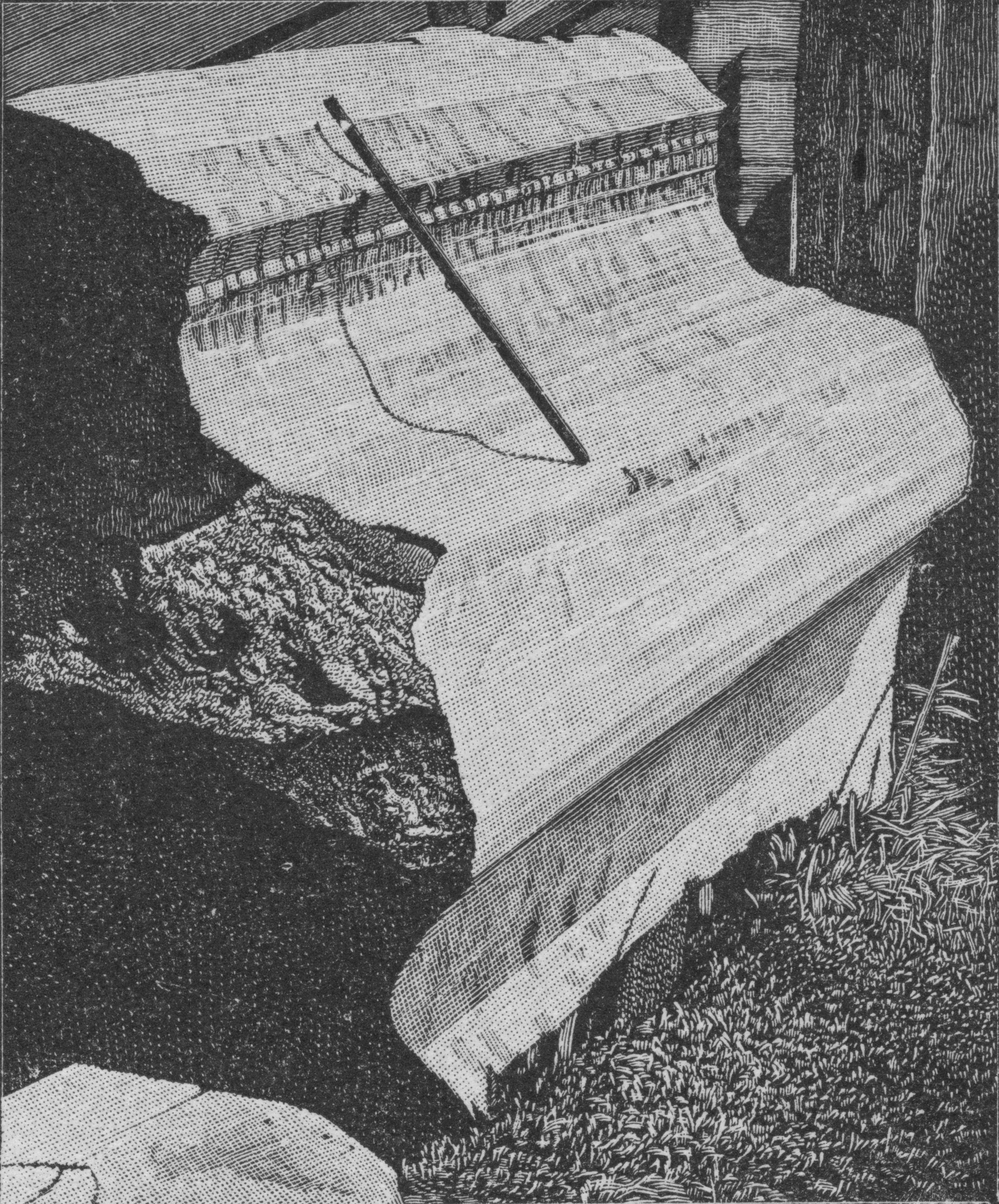
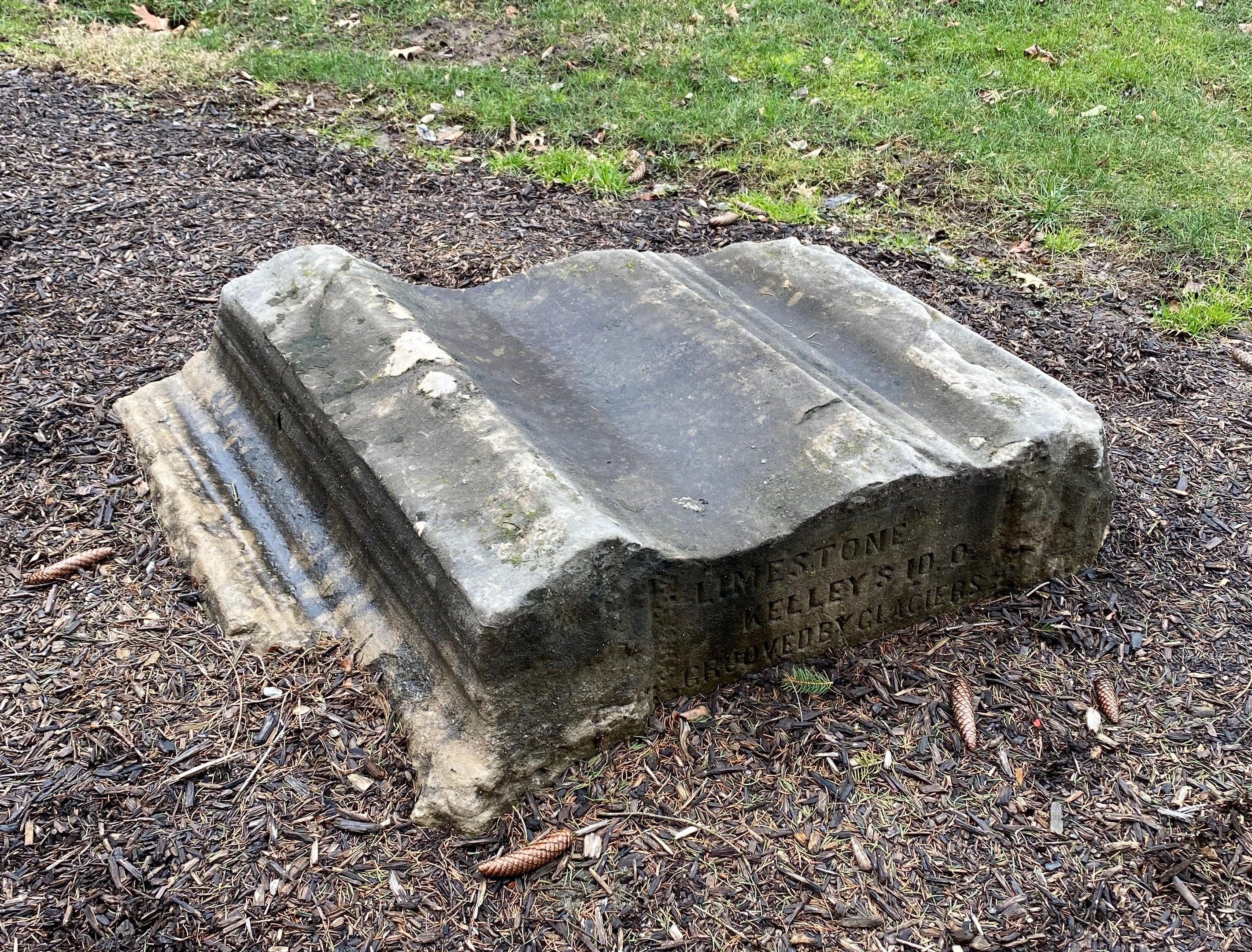
The engraving becomes an image when that printmaking plate is inked and a print is pulled off of that plate with a piece of paper. Sometimes glaciers and engravings overlap—take this scan of an engraving printed in a book from 1888 that depicts the lines cut by a glacier into a piece of limestone:
So many overlaps exist between glacial processes and the craft practices of printmaking. I have not seen this formalized in an analytical treatment elsewhere, but I first noticed an abundance of craft language in the observational texts of early North American glacial studies during the Second Industrial Revolution (1870-1914). Observational science is descriptive and empirical, but it precedes the formalization required for experimental science. Theory can emerge as descriptions accumulate, but it is messy and slow.
Reading older texts from this period of observation is a mixed bag, sometimes you read about obsolete ideas, other times you read about ideas that formed the bedrock of contemporary theory. Either way, the accumulation of observations creates the conditions necessary for recognizing patterns that support or detract from the development of a theory. Sorting out the good from the bad in this overload of information is part of the fun of tracing the development of a theory, and I think it has to do with the perspective of the original authors. It was new to them, so the writing feels fresh and vital.
These authors were coming to terms with the abundance of observations that suggested the North American landscape was shaped by a continent-sized glacier that they had never seen, something that resonates with my own interests as I document my attempt to understand a glacier without ever having seen one. In other words, I recognize their fervor because it maps to my own experience.
I had to laugh to myself when I noticed this hedging line about the density of the subject matter in the first paragraph of one of the primary texts from this period:
“Even within the bounds of a circumscribed subject the phenomena are so rich in variety that some restraint must be laid upon analytical treatment, lest it become wearisome through the very fertility of its distinctions.” Chamberlin (1888)
I am going to exhaust this overlap in content in a very long post that I promise will reward you for reading closely to the end.
What I am going to show here is how a simple decision in the construction of an image can make the difference between that image being seen as merely an illustration of a scene or as embodying substantive data about that scene.
I’ll do this while demonstrating a formal comparison between glacial process and engraving practices that contributed to the slow advance toward new theories (for the late 1800s) about the last ice age, and I’ll also test out the theory in a couple of printmaking experiments along the way in my studio.
This case is going to build slowly: accumulating details, pushing them forward, dropping some of them along the way only to pick them up again later, covering my tracks, finally receding away to expose lingering traces of a thought process that feels as slow and unknowable as a glacier itself.
What this study demonstrates:
The value of an image changes based on how well it satisfies a range of constraints.
This is shown through a series of comparisons of source photos and output engravings in government publications from the late 1800s during a time when new theories depended on quality data.
The analysis evaluates compositional strategies in representational images portraying real life surface detail on stone and the way that tool paths impact fidelity of those details in the process of engraving the printing plate used to print the image.
Engraving conventions are show to introduce systematic directional distortions.
These distortions violate cognitive continuity between geological process and representation.
These violations change the meaning of the images.
Instead of producing data-quality images for building theory, images with specific violations become less authoritative visuals functioning as illustrations rather than as evidence.
This matters for artists and scientists alike.
Part Two: How craft practices reshaped geological evidence
I picked up a couple original copies of Thomas Chrowder Chamberlin’s chapter “The Rock-Scorings of the Great Ice Invasions” which makes a systematic study of North American glacial striations as a chapter in the Seventh Annual report of the United States Geological Survey to the Secretary of the Interior, 1885-1886 (1888), and I was struck by the engravings Chamberlin used to depict the glacial striae at landscape-scale, at object-scale, and at the level of surface texture. It seems that some of the images of glacial pavements were meant to set the scene impressionistically, while others functioned as actual geologic data for a readership who might otherwise not see these sites and specimens first hand.
The fact that glacial striations are depicted by engravings is significant. Engraving is functionally similar to glacial striation, so in some ways it is an optimal medium for representing the content it depicts, at least in terms of a coupling of form and function. But it is also prone to error, so in some ways it is not optimal at all. Either way, engraving was the only option available at the time because of the limited state of capability in off-set printing at the end of the nineteenth century. We’re left with a trove of examples of technical decisions made by craftspeople which tells a story about how new theories in glacial science were developing hand-in-hand with advances in our capacity to describe the data visually.
I find myself continually circling a small set of seemingly simple questions: What is an image? What am I looking at? How does this function as data? How were these images initially received? What does this tell me about glaciers? What does this tell me about the craft of composition?
Engraving procedures themselves, like any expert practice of techniques, encode the epistemology of their practice. By looking at the product of a practice you learn something about what that practice knows and how they reason about the world as they see it through their particular lens, conditioned by their specific discipline.
Chamberlin’s use of engravings to illustrate his reports to the United States Geological Survey in the late 1800s presents a mixed bag of imagery that fills many functions, ranging from establishing visual context to operating as stand-ins for actual data. One image in particular establishes the backbone of this theory; an engraving produced from an original print of a photograph that I happen to own, and when I saw the engraving of this image for the first time, I immediately knew something was wrong about the engraving.
When I looked broadly at the engravings in Chamberlin’s texts across the decade of 1880, I sensed that he had intended some images to count as data but they failed to function as data because of the technical structure and strategy employed by the unnamed engravers producing these engravings.
I’m going to show that these failures of compositional strategy prevented some images from standing in as data when they could have, because they violated several principles across multiple domains from visual theory to psychology to glaciology, among others. I’m also going to look at what this means for illustration as a practice, and I’ll be testing my hand at producing engravings in line with the theme of glacial striation, while making this analysis in my on-going project An Attempt to Understand a Glacier Without Ever Having Seen One, which is archived at the Center for Art + Environment at the Nevada Museum of Art.
The key problem is the orientation of lines used by the engravers to create texture, because those lines depict the lines that glaciers scratched into stone and the engraver’s lines contradict nature’s lines.
In other words, the tool paths did not match the glacial paths.
Had the engravings been produced with tool paths that matched the path of glacial force, they could have stood in as data instead of merely performing as scenery-establishing imagery.
What emerges from this analysis is the confirmation of the communication failures between two systems of codified professional vision (the idioms and techniques of Engraving as a practice, and the formulation of imagery and diagrams to illustrate Geologic reasoning as a practice).
The core claim I will make here is that glacially-carved grooves have a dominant vector field in the fact that abrasion occurs along a continuous direction of motion. The engravings illustrating Chamberlin’s 1888 report construct the grooves using mark making that is largely perpendicular to that inferred glacial motion. This means that the engraver’s motor action does not align with the geological force trajectory, and this isn’t merely illustration, it produces an inadequate representation that breaks perceptual continuity, resulting in an image that communicates scenery rather than operating as an image that presents data about process.
I believe the representation failed because the medium’s operational strategy contradicted the geologic dynamics being depicted.
This is a shame because the process of engraving is functionally mimetic of the process of glacial striation. The fact that striations in bedrock are depicted by engraving in this 1888 text is significant and it opens a path of inquiry that offers insight into several domains simultaneously: visual cognition, media theory, historical scientific illustration, art history, knowledge transmission, phenomenological experience, and the psychological ontology of landscape.
Anyway, Chamberlin uses 50 illustrations in his 1888 text, and all but three of them are engravings based on photographs of sites that illustrate the theory his text produces. Some of the engravings stand as data while the remainder serve to illustrate.
I think it helps to see the variety of images from this text, and to get a sense of how they vary from each other categorically and individually, so I took a quick pass at categorizing them into groups. Here are nine basic categories (each in dashed circles with labels), clustered into three main groupings of type (Substrates, Incisions, and Objects) denoted by shaded amorphic forms, and two higher-order groupings (Data Stand-Ins, and Contour Structures) collected inside unshaded lines:
Part Three: Testing the image
Chamberlin was writing at a time when geology in America was trying to process all of the observational data that seemed to point to a new theory of continental glaciation. This moment in time preceded experimental empiricism; it was observational science, but it was still empirical in an interpretive sense. Saving a biography of Chamberlin for a later date, I’ll focus here on the way he used engravings to stand in for data for a community that was synthesizing the evidence for a vast continental-sized ice sheet as the agent involved in carving up the landscape of the northern United States.
One thing I will stress here is that he was writing at a time when science was still deciding how these landforms came to exist. It was Chamberlin’s tightening of standards in field-empiricism that enabled comparative observational data to become meaningful enough that quantitative modeling could become the next logical step.
As I outlined in this post, printing in the late 1800s was not yet able to reproduce photographs through off-set printing, which made engraving a niche industry in illustrating books. Most engraving firms produced contract work for publishers, and when it came to scientific illustration, firms that illustrated catalogs and children’s books would find themselves illustrating technical images beyond their expertise.
Also, as I mentioned in that post, I think some of the engravers rendered the long linear lines of glacial striations in more cognitively compelling ways than others, and I’m going to get into that in significant detail in this post, starting from a view of the engravings, moving into some theory, and finally—since I can’t judge these engravers without judging my own work—I will share the process and feeble outcomes of some practical experiments in glacial engraving that I undertook in my studio as I attempt to draw formal comparisons between printmaking and glacial processes in my quest to understand the continental ice sheet that shaped where I live.
Chamberlin’s engravings deal with linear forms carved in stone, and in a search for comparative engravings featuring strong fidelity to the actual lines of nature, I came across a significant contrastive example in botany, where linear forms define the vein structures of leaves and blades of grass. Bear with me for this brief digression so that I can make the case for why I think fidelity between real-world data and the decisions made during the process of engraving matter for the rendering of representational data. It’s interesting.
In Chamberlin’s reports we know that Dalziel Brothers and Hart & Von Arx produced many of the engravings from photographs taken by Chamberlin, A.C. Platt, and others. The key point here is that the engravings were not produced in-house, they were contract labor produced in engraving shops outside of the institutional locus of the research itself, which I think matters significantly in the type of quality we see displayed in the variety of images Chamberlin published.
Occasionally, authors of government reports and scientific research would produce the engravings themselves, or at least in close collaboration with a specific engraver. For example, a decade after Chamberlin’s texts were published, F. Lamson-Scribner’s comprehensive works on American Grasses printed by the U.S. Department of Agriculture (1897-1900) were careful to control the engraving process, realizing the engravings were a kind of identification data for the differentiation of species:
“The drawings are all from carefully selected specimens, the habit sketches being made by Mr. A.H. Baldwin. The enlarged details were drawn by myself, with the exception of a few which were made by Miss M.D. Baker. The engraving is the work of Mr. L.S. Williams and Mr. George P. Bartle. The work has all been done in the office of the Division, with the exception of that performed by Mr. Bartle.” - Lamson-Scribner, January 22, 1897
I point this out because the specificity of identifying the chain of custody of image production in a scientific text like this signals that the imagery is important. It is important; it functioned as data. The botanical details used to identify grass species feature long linear patterns whose directionality are important in differentiating one species from the next. Graver lines are contrastive data across images.
Back to Chamberlin’s text. Throughout his report he describes the engravings in both the captions and the narrative, and occasionally he vocalizes his opinion of the quality of the engraving, which I think is important to note since it makes the case that Chamberlin believed these engravings were standing in for data for readers who would not otherwise see these landforms in person. If nothing else, Chamberlin’s commentary on the engravings offers a window into the publication timelines and the lag between commissioning the engraving, receiving it back, and the deadline that made it impractical to request a revision of the engraving.
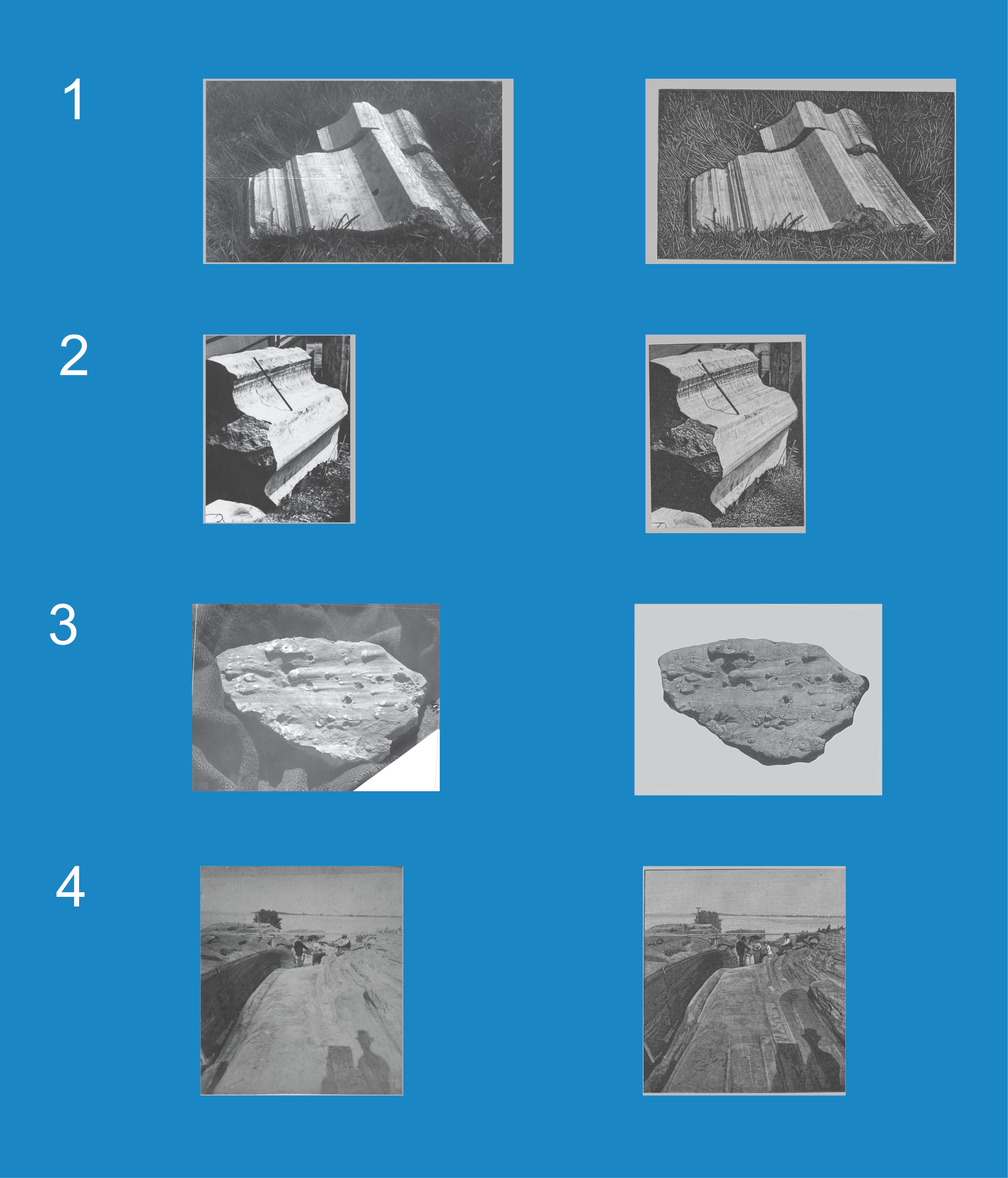
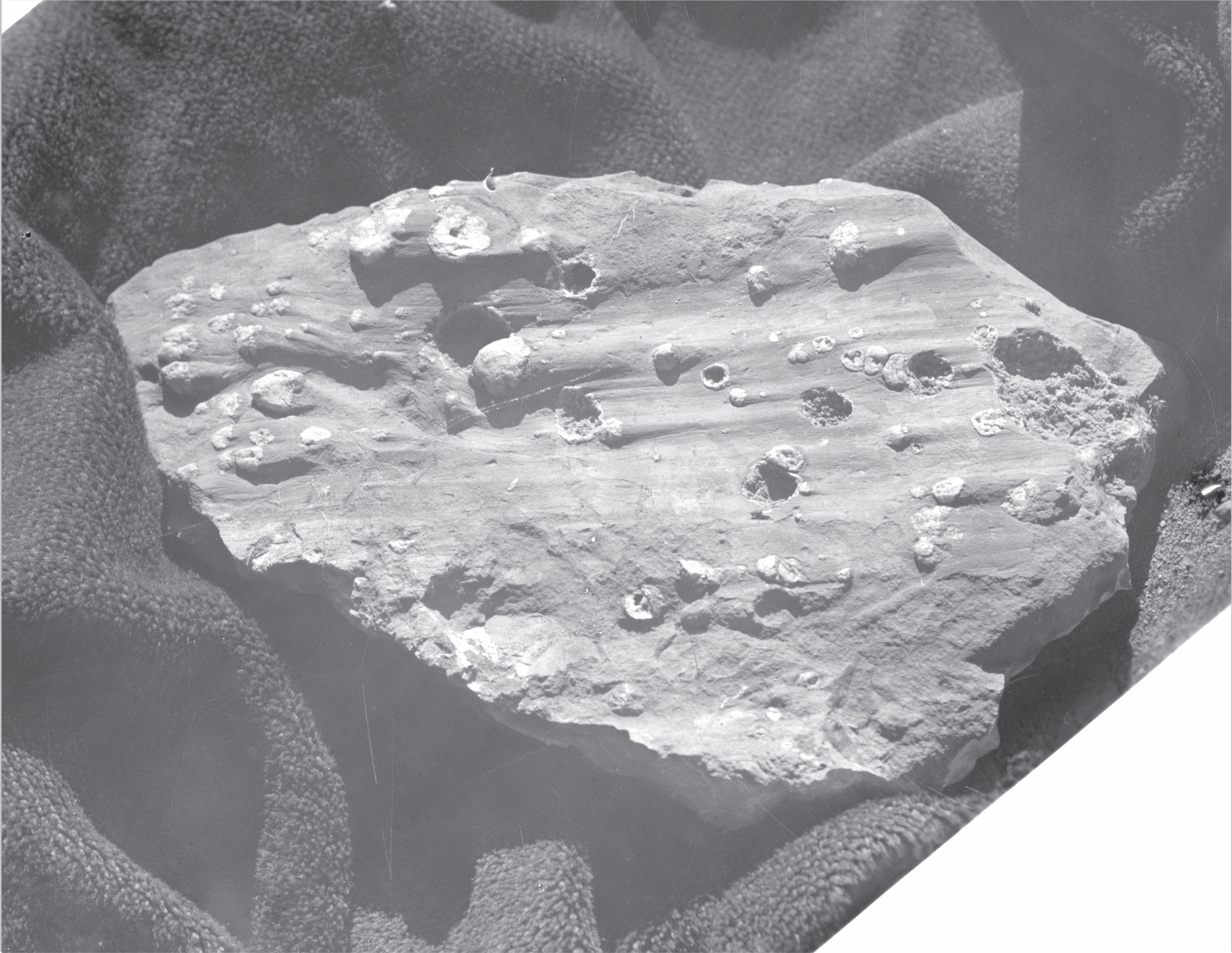
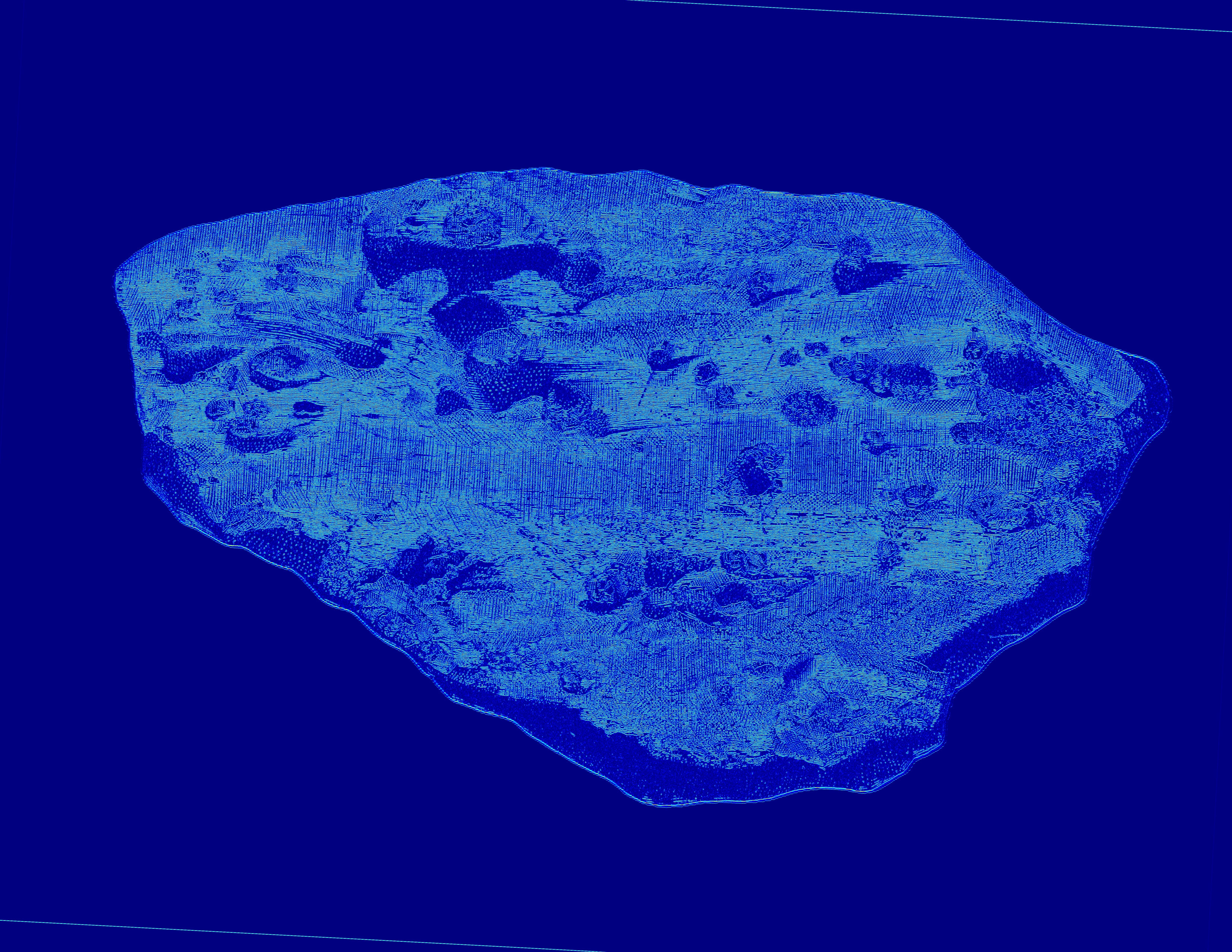
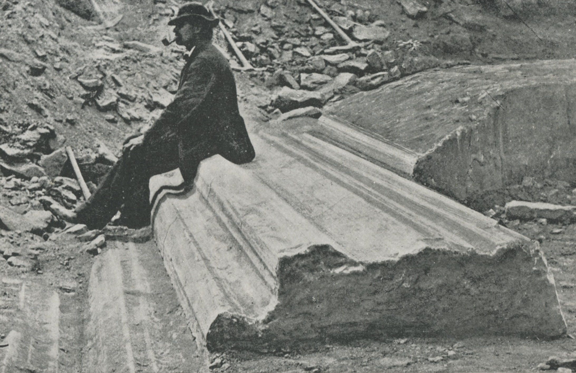
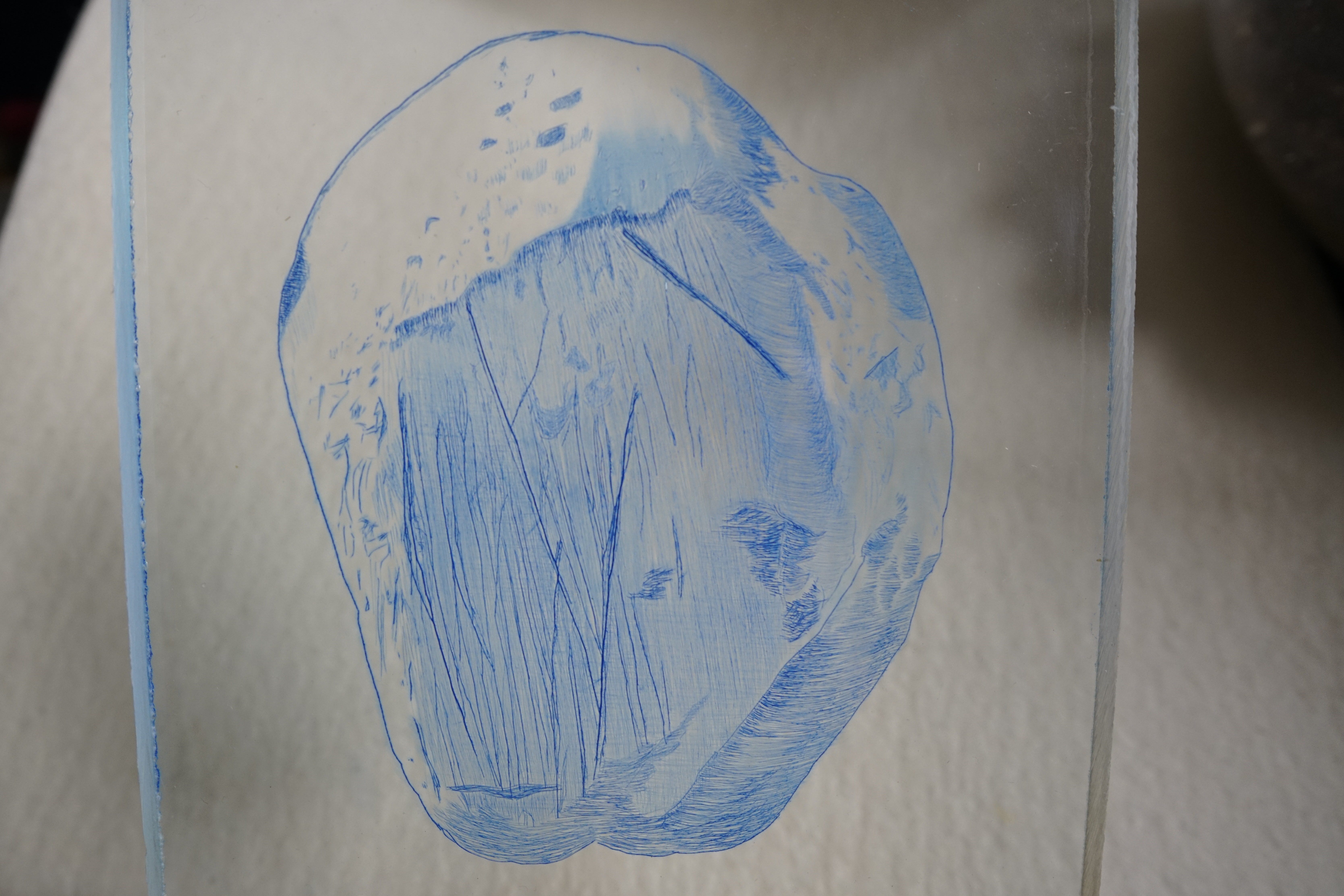
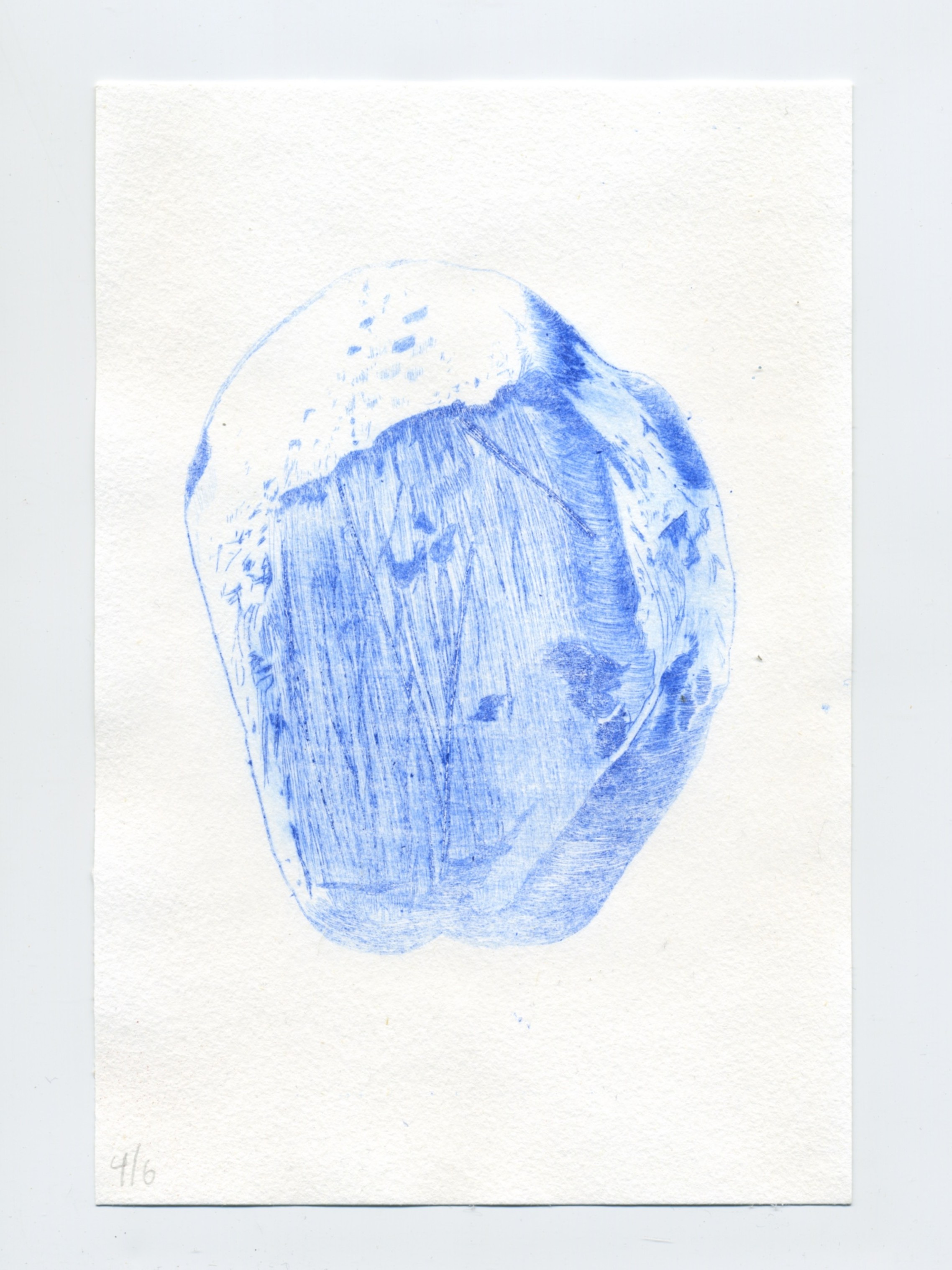
When I first opened his text, I came across an image I already knew intimately, since I own the original photograph Chamberlin’s engraving was based upon. This photo is of a long view down the “Great Central Groove” on Kelleys Island captured by A.C. Platt. I had looked at this photograph for a long time before seeing the engraving created to represent it, so I know I’m slightly biased, but I hate the translation. Here is the pair (image on left, engraving on right). I’ll be referring to this as Pair 4 throughout the text. Here it is:


As I’ll show later in this post, the engraving violates psychological principles that are present in the photograph. That violation flattens the image from a high-fidelity photograph that encodes the directional motion data preserved in a geologic scene and turns it into an image that counters the direction of glacial motion. The engraving contradicts the glacial motion by attempting to represent it with the use of graver tool-path trajectories (shown below in red for a selection of lines) that move perpendicularly to the actual path pf motion of the ice (shown with blue arrows) that carved the groove trough.
I’m sensitive to this starting to get tedious, so I’m not going to spend a long time on this image just yet, I want to get through several more images to build the case before I dive in deep on thoroughly analyzing any particular engraving.
Because so many of these engravings were based on photographs, I wrote to the USGS archivist to see how many I could track down. The archivist was able to send me several of the source photographs taken by Chamberlin that were used to produce the engravings. They didn’t have all of the images, but they sent enough to build a case. I was able to get high resolution scans (1600dpi) and I scanned all of the engravings at 1600dpi as well. This gave me a small dataset that I could use to run some comparative statistics, and I spent two weeks in February looking at these image pairs from both quantitative and qualitative angles, and analyzed them vis-a-vis contemporary visual theories from cognitive science to see what I could learn. This all ended up pushing me into experimenting with my own hands in my studio producing new printmaking methods, so I think it’s useful to share here as context.
I want to concentrate on four photo-engraving pairs today (the photographs (left) and the engravings (right) are both registered in size and layout for analysis, some of the photos are cropped from their source to match the size of the published engravings. Here are the four pairs:
The USGS sent me more photos than these four, but these were the only ones that were actually published in Chamberlin’s 1888 report. Regrettably, none of the highly-detailed data-quality detail images were included in this set, but my 1600dpi scans of those engravings give enough detail to reconstruct the glacial motion force path and determine the fidelity of their graver paths to the striations.
For speed, let’s move on to image pair one. While that first image (now called Pair 4 Photo) is of a landscape and features in situ, this second image (now called Pair 1 Photo) is of an object removed from the landscape. It is an image of two blocks of grooved limestone laying in the grass. Here is the photo, followed by the engraving (note the gray borders around both images, they are registered for optimal overlap so that I could run statistical processing):
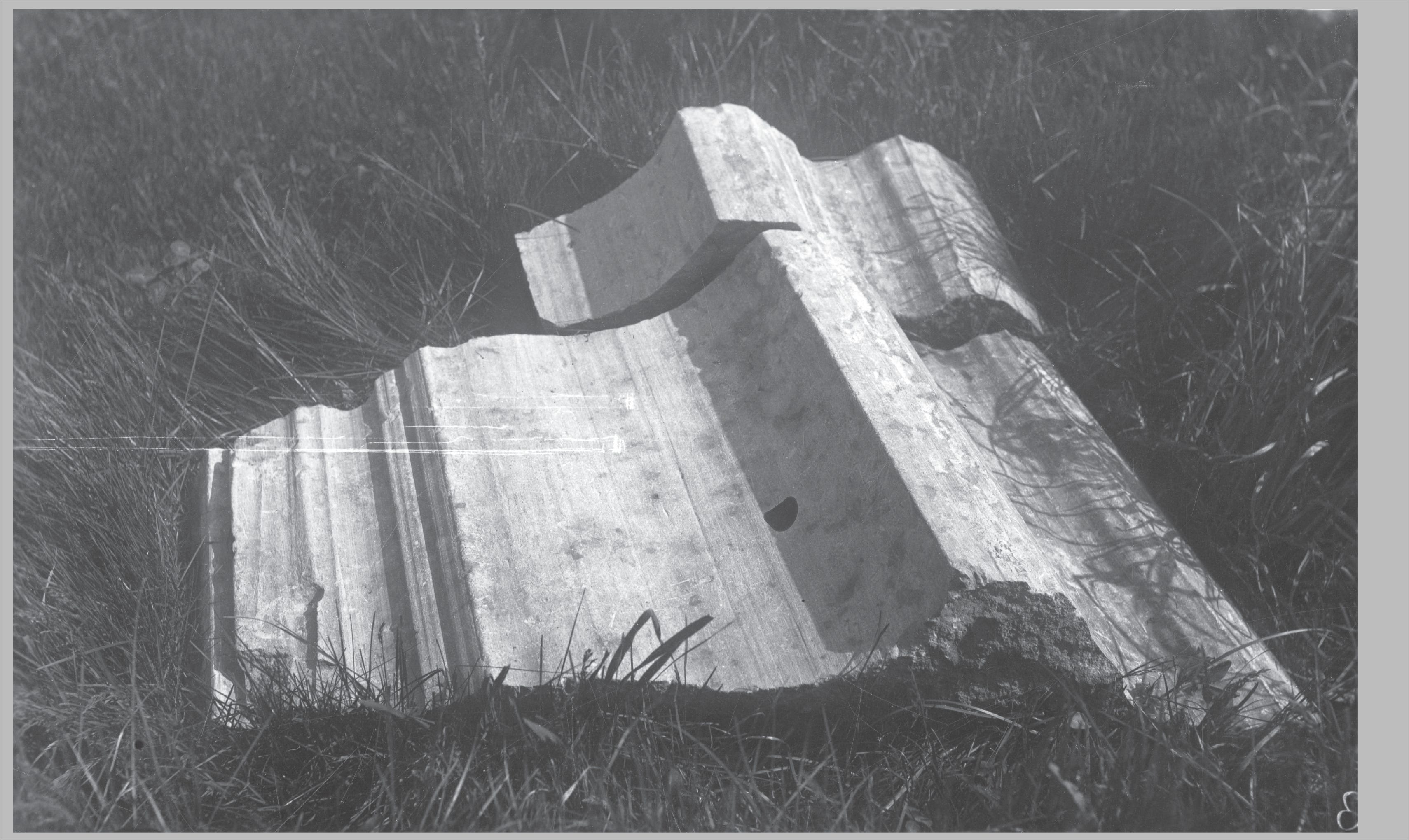
The geologic structure of these objects are functional traces of the actual motion that produced the structure, so in some ways, it makes sense to expect that the engraver would produce strokes that align with the geologic motion present in the stone. I know there are some differences in 2D representation, and even the selection of an approach to printmaking changes this, but for engraving I think it’s safe to expect the major trajectories of these traces in stone to determine the strategy of manipulating the major trajectories of the graver as it cuts into the printing plate to render those traces in the engraving.
When I compared the source photo to the engraving output, I was able to evaluate the fidelity between the graver tool path and the glacial abrasion path—to see how closely the engraver followed the geologic structure—and I was able to quantify the alignment at a high level. The faint green line in the center of the image indicates the average axis of the abrasion path marks on the stone, and the crossing navy blue line indicates the average axis of the engraver’s tool path across the image to produce the representation. They are roughly perpendicular.
Clearly this engraving expertly uses shadow and idiom to produce the composition so that the object can be read dimensionally. I’m not arguing that it is a bad image as a visual object. I am arguing that it is a bad image as a piece of geologic data, because the object itself (the stone) was produced with motion directionality that is the data about the glacier that carved it, and this directional trace should be fully evident in the engraving if the engraving is to stand in as data.
This next image is a scaled view of the engraving which shows that the secondary cross-hatching to achieve toning in the highlighted faces of the stone (annotated in navy blue) violates the trajectory of the glacial abrasion path (annotated in green). Stock removal on the engraving plate goes against the orientation trace of stock removal on the glacially striated stone.
So far the two examples we’ve seen are functioning less like data, and more like evidence impressionistically establishing the scene and depicting groove contours at an order of magnitude that don’t necessarily need high fidelity between the engraving and the photo, so long as the impression of the direction of ice abrasion is evident in the quick glance at the composition of the engraving. But Chamberlin presents several more nuanced engravings in his text that are meant to do more than build the scene, they are meant to stand in for data.
Consider this engraving (Chamberlin’s figure 35):
Unfortunately, the USGS library was unable to locate the source photograph for this engraving, so I was unable to analyze it statistically, but the detail of this tight view of striae, the crescentic marks, and the crossing gouge marks are legible as data to anyone with an understanding of layering in composition. By necessity there is crossing that must happen compositionally in sequence to depict the actual crossing gouges of later glacial striae crossing earlier glacial striae, so resorting to an idiomatic engraving process like cross-hatching functionally violates the compositional goal and prevents a close reading of this image for what it must communicate. In the physical specimen, this crossing depicts the time stamps of the original marks laid down by the glacier, and preserving that information successfully depends upon its legibility in the engraving as a sequenced event. The goal of the image is to show the overlap and crossing of glacial striae, so any overlap and crossing must serve that goal as if it were a tracing.
And here is an even tighter view of a portion of that image:
Notice how the highlighting is achieved not through additional long stock-removal for secondary toning (as if to increase line weight), but the engraver uses short scooping punctum. Yes, they still run perpendicular to the main gouges, but only locally, not globally as they do in earlier images. There is restraint in using marks that might otherwise violate the clarity of the trajectory of the striae. Compare the short point-like gouges (royal blue) to the long linear gouges (green) in this detail of Chamberlin’s figure 35:
And now compare that figure to Pair 1 (Chamberlin’s figure 28) below where we see the green establishing the primary gouge direction (which also matches the glacial abrasion path), crossed over by the royal blue secondary gouges placed down globally across the section to establish toning for that region of the image:
There are no records of the names of the engravers of these two figures, but based on the recurrence of the techniques across the full set of Chamberlin’s images, and the function those images, the grouping of images employing the global cross-hatch vs the grouping of images employing the shorter point-like hatching, I feel confident they were created by different hands. I’m further convinced because they are compositional strategies that are applied indiscriminately across a variety of images rather than operating as compositional strategies employed judiciously within the same engravings when the need for each technique arises in the depiction of the content.
Other images in Chamberlin, 1888 do show the names of the engraving firm in the bottom of the engraving, or they note in the caption the source of the image. Notably, both figure 35 and figure 28, and others in those styles, lack an indication of the house that produced the engravings, but in the case of figure 35 they do indicate they are based on photographs from the “educational series of the Survey” so the engraving depicts a textural feature that some of the scenery engravings cannot faithfully depict in a meaningful way. No matter what, it is clear these engravings in the style of figure 35 operate as data.
Here are two other engravings that approach data-quality, all from the educational series:
And here is an engraving that Chamberlin provides additional commentary about the production of the engraving, indicating he was aware of the communication value of every mark on an engraving—he identifies the white flecks as snow that had fallen on the stone which showed up in the photograph, and which was ultimately rendered by the engraver despite it being meaningless for scale or other function in the engraved image. Chamberlin writes: “The granular appearance of the surface is due to snow falling at the time the photograph was taken.”
But if we zoom in on this image, we can see this image is not like the data-quality images. The engraver attempts to indicate direction of travel by toning, and achieves this tone by laying down perpendicular lines as the first layer (suggested by the light blue), followed by repeated short secondary toning gouges that move parallel to the direction of travel (depicted by short green arrows). The gouges which faithfully trace the direction of travel are the secondary marks in this image, they finish off the engraver’s rendering instead of establishing the gesture of the groove as they do in contrasting images. If gestural fidelity is a concern, secondary marks should only be used to establish tone, but I believe this engraver was concerned with compositional fidelity (further evidenced by depicting scattered snowflakes from the photo). Chamberlin uses this figure in a section about jagged grooves produced in coarse stone, this figure depicts striated sandstone.
At this point I think it is safe to say that the engravers were general illustrators who were producing what they felt was visually convincing, they were not scientists focused on how the image would be read as data. That surprises me considering the context of where the images appear (inside an official report of the US Geological Survey), where I would expect the images to be faithful representations at a more granular level. This was the primary research publication at the time, and it was the closest thing to data that readers across the country would cite in their subsequent works that eventually coalesced into the accepted theory. If, as with F. Lamson-Scribner’s American Grasses engravings, there had been only one or two engravers and they worked in closer conversation with Chamberlin, we might have better data.
As I’ve alluded to elsewhere, I bet the engravers had never seen in person the subjects they were depicting. They were working from photographs, and the report itself was developing the science around the interpretation of the marks in stone, so you can’t blame them for not doing a better job. Most of the readers of the report didn’t even know how to interpret the marks at this point in time; a significant focus of the report was to help readers recognize and understand the marks. I can’t blame the engravers, but I do wish Chamberlin would have exercised a little more quality control. It would have strengthened the rhetorical value of his argument and tightened his claims at a discourse level. But it’s fair to say there was no first-hand exposure on the part of the engravers, which always comes through one way or another in 2D work rendered from photographs.
Why does this matter?
Part Four: Professional Vision & Particular Ways of Seeing
Engraving is a particular profession, and shops were particular communities. They knew things about the tools and techniques that non-specialists did not know, did not need to know, or didn’t care to know.
Looking at these different engravings with Charles Goodwin’s model of Professional Vision (nb: this is a 2009 reprint of the 1994 original), we can see Chamberlin practicing the three disciplines of a professional. In Goodwin’s terms we can say that Chamberlin was coding the range of glacial striation, while highlighting key details about particular specimens and sites, and producing and articulating material representations of that through the use of engravings. Similarly, the engraving shops were coding what they saw in the imagery as they planned their compositions, while handling some compositional problems with strategies that highlighted what they understood the image to be speaking, while making judgement calls in the act of producing and articulating material representations with every single graver stroke and gouge and scratch they made on the printing plates. What happened here was a misalignment of competing systems of professional vision in the design brief exchanged between Chamberlin and the various engraving shops in his commissions.
I think about this when I read Chamberlin’s works because he often asserts in the text whether an image does a good job or a poor job of explaining the image. He highlights what should stands as evidence, and he laments inadequacy of some images to explain. I believe that Chamberlin would agree with an embodied cognitive theoretical assertion that using the trajectory of the glacial movement as the trajectory of the graver tool path is a better way to depict the data in an engraving.
There is a lot more to say on professional vision and these engravings, but I’ll save it for a future article on glaciers as object makers where we’ll look at how Chamberlin relied on craft and tool metaphors to describe the glacial structures depicted in the engravings, and how that might have contributed to advancement in geologic reasoning about continental glaciation in America. There is strong overlap between Chamberlin’s metaphors and the actual practice of engraving, so much that I wonder if Chamberlin was influenced by engraving as he made sense of the marks he was interpreting.
I don’t have complete timelines on which engraving firm produced which images first, but six years earlier, Chamberlin published “Preliminary Paper on the Terminal Moraine of the Second Glacial Epoch“ which appeared in the 1882 Annual Report of the United States Geological Survey, and each of the exquisite engravings in that 1882 report were produced by J Dalziel of Dalziel Brothers. Here is one of my favories:
Note that the linear path of the tortuous grooves are traced along the path of glacial erosion by way of graver tool paths that run fully parallel to that tortuous channel. No oppositional toning was needed in this rendering of the groove structure, so clearly a well-executed rendering of the glacial grooves and striae do not need to rely on secondary visual idioms to produce the correct gesture with the correct naive physics.
While he does not explicitly state that using the trajectory of the glacial movement as the trajectory of the graver is a better way, Chamberlin (and his contemporaries) often described glaciers as producing (“graving”) lines with gravers held tightly.
“…the symmetry, continuity, and peculiar form of some of which are only intelligible on the supposition that they were cut by a single graving tool, held with sufficient tenacity by the ice to excavate by a single movement a deep, sharply defined groove…”
When I read that I can see it suggested by the structural decisions in the Dalziel Brothers image above. Just a note for thoroughness, Dalziel Brothers were noted for carving their printing plates into the end grain of a boxwood blank, while Hart & Von Arx produced dry point etchings on metal plates. I mention this because I’m trained in wood and metal, and knowing what I know about metal, the sweep of a graver moving through material vs the sweep of a gouge through end grain of a hardwood like boxwood, I would expect the metal engravings to have more fluidity to the prints, but it is the wood plates carved by Dalziel Brothers that convey to me the most immersive and compelling treatment of the grooves. They had it harder but their images were more elegant while being faithful to the details of the subject matter.
Now let’s look back at this engraving from the 1888 report:
The real-life structure of this glacial groove is like a riverbed which invites the gaze along the deepest part of the river because the perceptual system expects directional reinforcement. So orientation cues should be stabilizing eye movement along the dominant vector when looking at the image. But in the engraving, the marks run orthogonal to motion and each stroke acts as a termination of directional flow so that the viewer has to reconstruct the length of the groove through serial inference instead of through direct perceptual continuation. It’s a series of blocks that resist the eye to the point that continuity in this engraving is something we are forced to infer instead of something we perceive.
Sometimes horizontal lines receding into a vanishing point help establish a sense of depth. Take for instance a railroad track seen from an oblique angle. The two rails form strong visual priming for linear leading lines, but it’s the crossing railroad ties that I’m interested in here since they run perpendicular to perspectival trajectory. The distance between each railroad tie is constant, but they will appear to be spaced farther apart in the foreground than they do as they vanish into the distance. This engraving is not like that—all of the crossing lines are spaced evenly as they move from foreground to mid-ground, so the engraver’s evenly spaced lines aren’t contributing to depth perception the way we would expect from what we know about our encounters with railroads in the real world.
I wonder if this might also be connected to the Ponzo Illusion, which shows how our vision is actively rescaled by depth cues, where two equal-length horizontal lines cross vertically-converging lines in perspective and create a situation where the horizontal line that is nearer in overlapped perspective appears shorter than the horizontal line that is further from view in the overlapped perspective.
In Yildiz et al. (2019), a stimulus that was structurally similar to this glacial groove structure was presented to subjects in a variety of configurations and textures. The goal was to look at the way that linear perspective cues and texture gradients influenced depth perception, and both were seen to influence size in depth, but this study confirmed that linear cues had a stronger, more dominate effect experimentally among this subject pool.
Here is the original stimulus set from the Yildiz et al. study:
Note that the gradient texture in the “A” stimulus was more of a cobblestone texture than the consistent perpendicular-to-motion cross-linear tool paths in our glacial groove engraving, so it’s not a one-for-one comparison, but it does establish the way that linearity enhances rescaling in scenes structurally similar to this rendering of the grooves, so it’s worth mentioning here because rescaling is an active processing of visual information and Yildiz et al. shows that linear perspective doesn’t tax cognition down the field of view in the composition (in my reading). It is also worth noting that linear perspective is still reinforced through the recursion of the texture, so take the comparison with a grain of salt.
Since I mentioned the spacing between the orthogonal lines remaining constant, I should also mention that I also initially analyzed the tensor structure of this engraving, but I quickly realized that was the wrong approach because my focus is not on the gradient of light, it’s the directionality of the tool path with respect to ice flow trajectories, and the tensor maps do not address that in a meaningful way for this situation. This will come out in Model A in the statistics section.
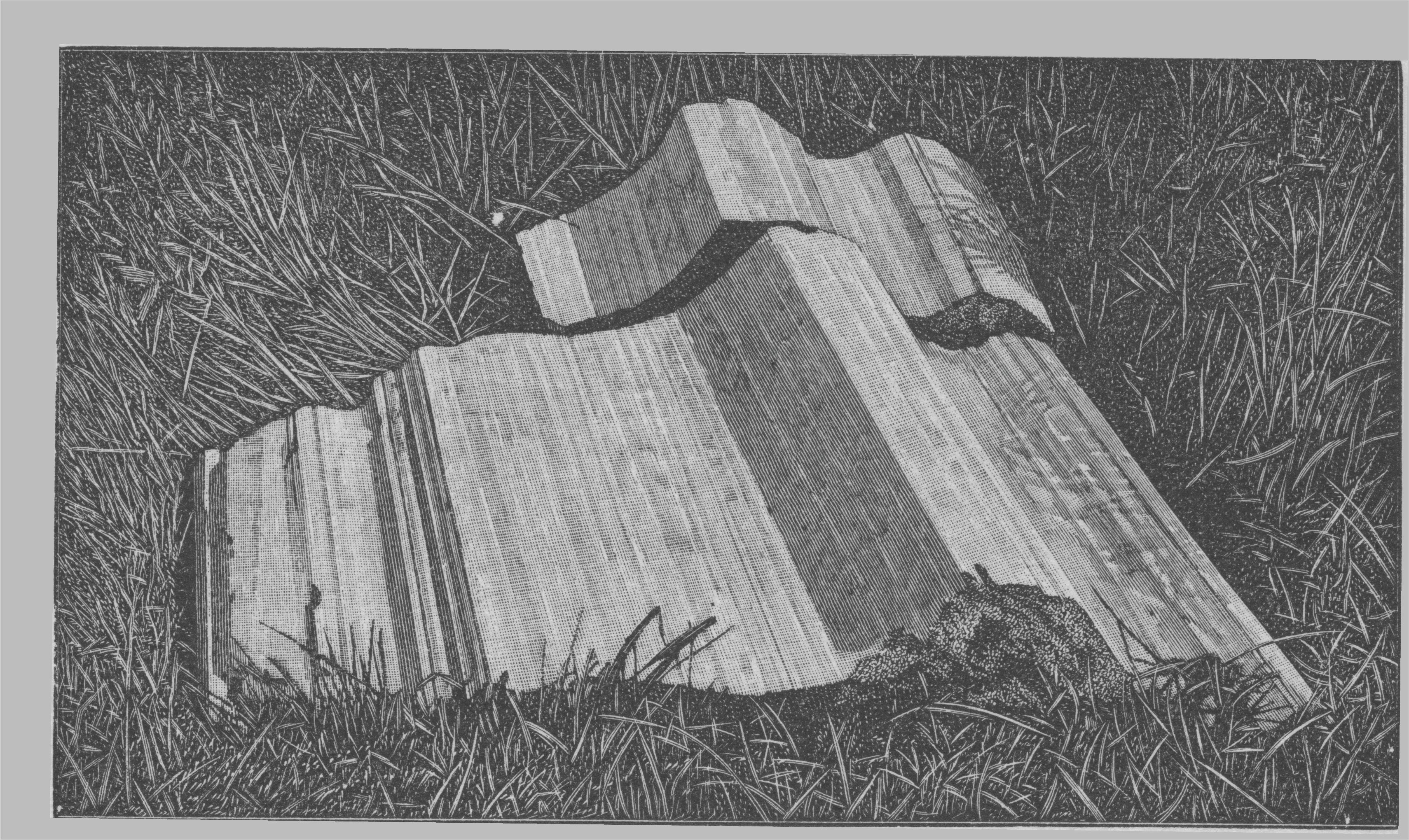
At this point I want to jump back to the photo-engraving pairings that I’ve been able to dig up in my research on this report from Chamberlin, and look at some of the things I found while computing the statistical fidelity between the engraving and the photo. We’ve already looked at Pair 1 depicting bedrock stone as an object, a large chunky block laying in the grass. We discovered the engraving strategy was treating this more like an illustration and less like a piece of data. Another pair inside the report involves a hand-specimen of stone that has been striated, it’s scaled down significantly from the bedrock block in 35. Take a look at this engraving from Pair 3:
…and here is the photo that Chamberlin took that became the source for the engraving (nb: I cropped and registered it into alignment with the copy of the engraving that I ran through processing):
The engraving clearly used perpendicular cross-hatching to create highlights and groove depth in the tone in the main bands. Here’s an image modified to bring those crosses into focus:
What the engraving gets right about glacial motion is the global orientation of the bands of the striae in general which are laid out with primary tool paths moving across the image, but the engraver then obliterated that primary trajectory path by highlighting with graver tool paths that run perpendicular to actual motion on this piece.
Now quickly on to Pair 2:

Like Pair 1, this Pair 2 engraving uses a primary stroke orientation that aligns with the path of glacial motion, but the engraver went back over the work with a perpendicular tool path for the secondary strokes in order to create toning on the washed-out portion of the stone as depicted in the source photograph. It seems that the engraver was aiming for visual fidelity to contrast between the rendered engraving and the photograph, but not really understanding fidelity between graver tool paths and the trace of the glacier on the stone as an object.
When I first saw this engraving, and then later the photo, I felt like it was familiar to me. But it wasn’t until I paired it with this image that I made the connection:
The photo above is an actual column of glacially fluted stone laying in situ in the north quarry on Kelleys Island. I believe this is the section that the specimen block in Pair 2 was cut from, but it is important to note that the groove contours are natural. I point this out because I’ve discussed this image in the past with people who had the first impression that the fluting was carved by a sculptor or mason. This fluting is the natural work of glacial agency. This photograph appears in many texts, but my scan here is from G. Frederick Wright’s (1889) The Ice Age in North America. Wright was a contemporary of Chamberlin, although in some respects, not an equal peer. Wright’s background, reputation, affiliation, and relationship to Chamberlin are interesting, but not important here. However, I mention Wright because I believe he was responsible for the acquisition of the Oberlin College specimen pictured below as it lay today on the campus. The contour profiles of this partially buried stone match up with some of the contours in both the Pair 1 and Pair 2 source photos, although the Oberlin specimen has additional mass that the Pair 2 source photo lacks, but the match up is significantly close to say with certainty that they came from the same linear section of the grooves.
Specimens were cut from the Kelleys Island grooves and distributed across the country as curiosities. The bedrock has become an object, and the object has traveled far, just like the hard rock bedrock of the Canadian Shield that fragmented into objects that traveled south to carve the bedrock limestone from which these specimens were cut. More on this in a future post about glaciers as object makers and their relationship to sculpture, but now I want to refocus on print making.
Part Five: Print Making & Glaciers: A Formal Comparison
Even in basic language about glacial movement, printing is present. For instance, the glaciological term “overprinting” refers to the process where a glacier covers its earlier tracks with new ones that obliterate (or at least superimpose themselves over) the earlier ones.
Dry-point etchings and intaglio printing are apt metaphors for imagining the massive etching that glacial scratches could produce. Yes, a glacial pavement has an engraved surface, but the stones that did the engraving also show a variety of scratches and scouring marks.
These glacially-transported stones operated as the graver to cut the lines in bedrock, held, as Chamberlin puts it, with “sufficient tenacity by the ice” to engrave the grooves. But the action of carving bedrock wears down these stone tools in a variety of ways.
The rate of decay in a stone tool relates differentially to the composition and hardness of the stone tool, the abrasive force of the glacier, the resistance faced by the stone as it grinds into bedrock, among other factors. Some stones wear away faster than others.
Some fine igneous stones—like quartz—wear away smoothly and evenly, producing smooth bedrock grooves, whereas coarser igneous stones—like granite—consisting of many types of crystals of different sizes, shapes, and hardness, differentially wears away through the grinding process to produce a textured bedrock surface. In both cases, the stone the glacier uses to make the mark itself will deform to receive a texture that evolves through mutual abrasion. All other things being equal, tight grained stones wear away smoothly, coarse-grained stones maybe less so. I’ll get into this more when I make the case of the glacier being an object maker, and we’ll explore why granite behaves the way it does (I have many examples produced both naturally and through empirical experimental tests). But since we’re focused on glaciers as image-makers in this post, I want to return to the idea of a glacially-transported stone operating as an engraving tool.
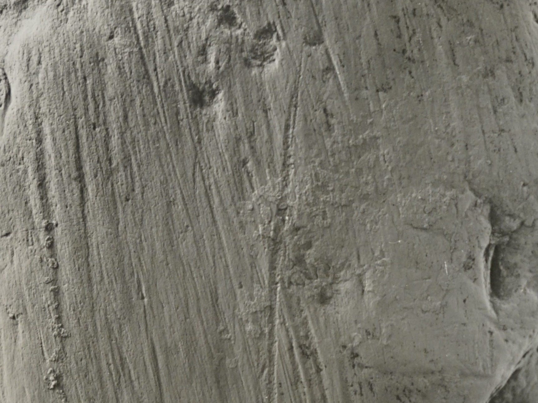
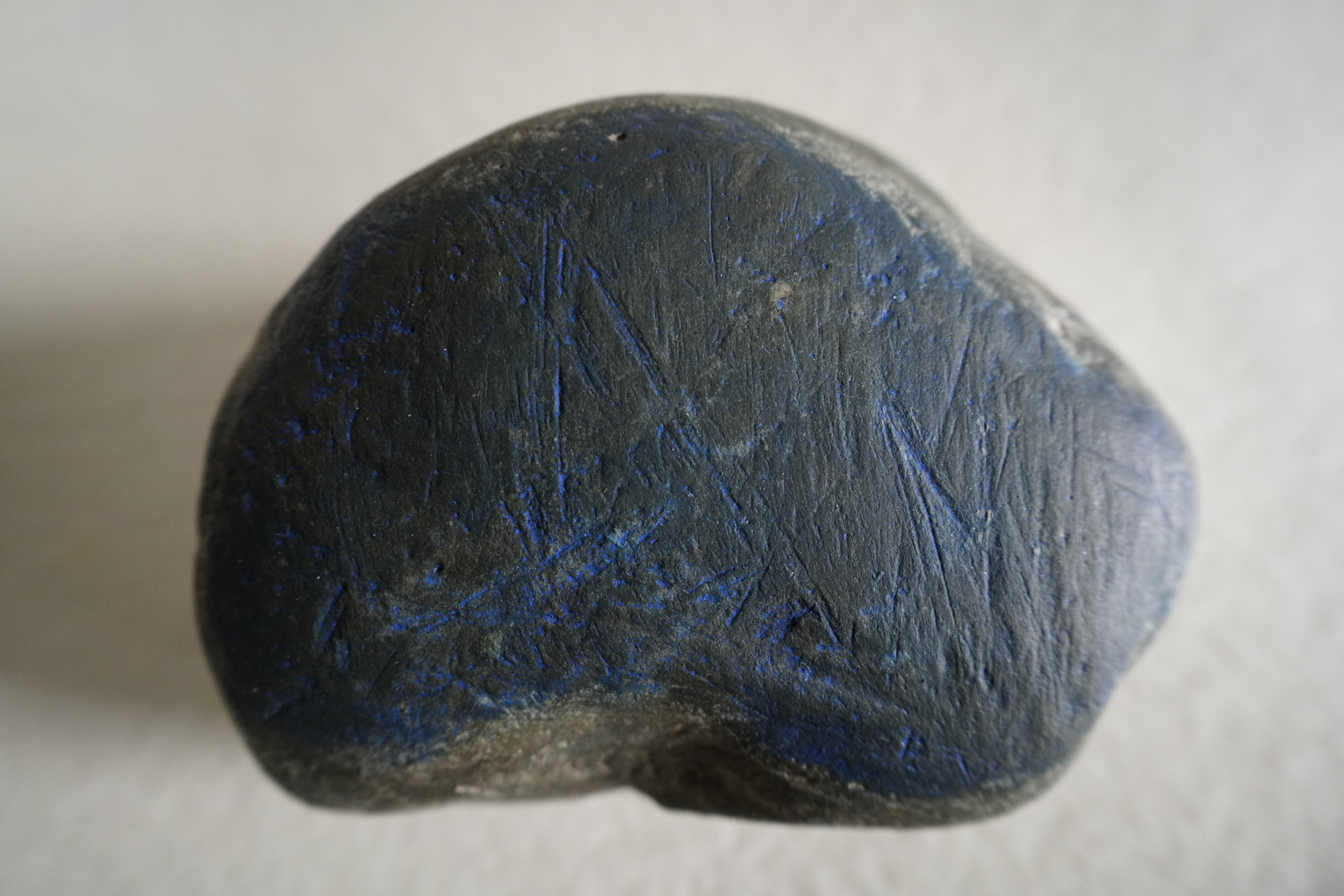
Take this 1919 glass magic lantern slide from my collection which depicts a pebble from Kansan drift in Nebraska. This pebble was held by ice as it was being transported, the pebble was the tool, and it shows deformation from abrasion that happened at the interface of the tool and the bedrock surface it was abrading:
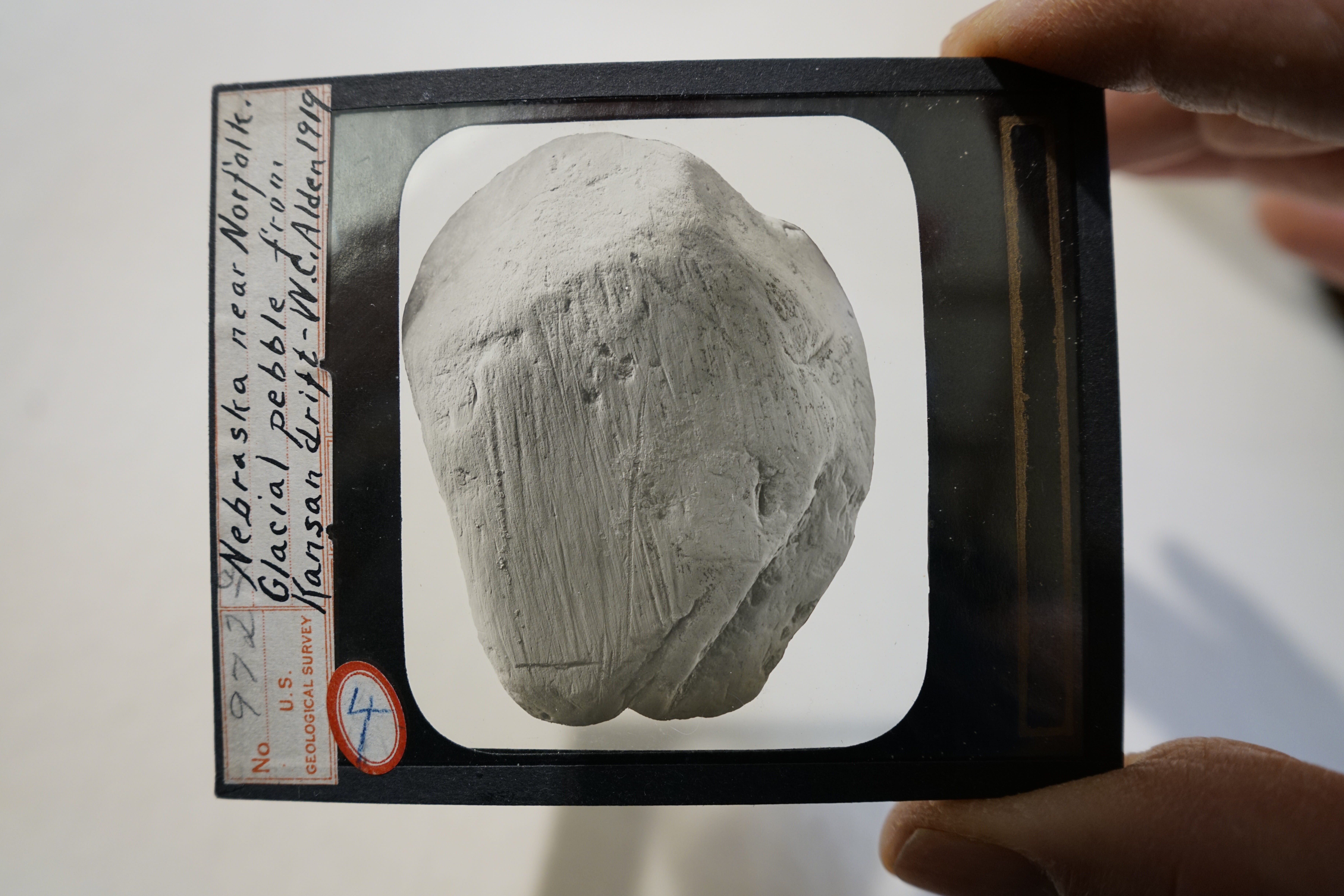
It’s covered in micro-striae.
It almost looks like a printer’s plate itself.
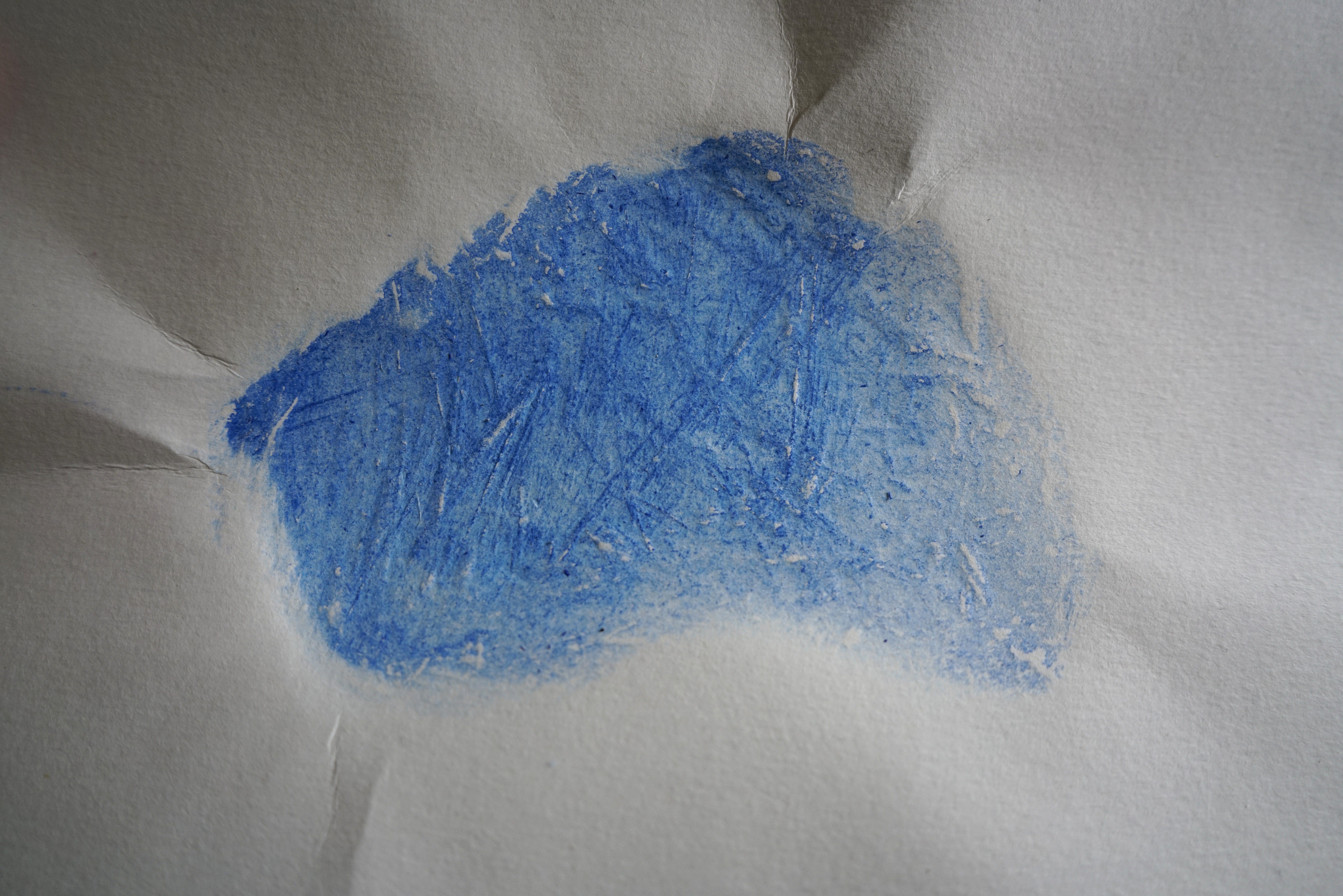
This image is smooth, it is a photo developed on the surface of the glass, so I can’t print it as is, but I decided to create a dry-point etching replica of the image on an acrylic plate which I inked in cerulean blue hue. How professional engravers produced images with the degree of feature fidelity that the Chamberlin engravings show is beyond my ability to comprehend or to replicate. I’m not interested in becoming a print maker, but I feel like I can’t understand the challenges of the process without trying it out myself, so I did my best.
And I pulled a series of prints of this etching to see if I could get the image of the stone to behave like a real printing plate.
But why stop at an etching? If the stones themselves look like printer’s plates, why not pull a print from the stone itself?
So I dug through my collection of glacial stones and printed a handful that had flat bottoms covered in scratches. Here are some of the first rough attempts from that process. These are specimens as much as they are artworks.
By rendering the glacially-transported stones as printing plates, I translate their utility away from data and into image. It is less a representation than it is an imprint.
Are the images produced by these stone printing plates better called lithographs? Obviously not in the Art Historical use of the term, but perhaps they are a kind of functional lithography in a compounding of the Greek lĭ́thos (λῐ́θος, lithos, or stone), and grăphĭ́ā (γρᾰφῐ́ᾱ, -graphy, or writing/drawing). Perhaps a sort of crudo or brut lithography. Perhaps more deserving of being called lithographs than images drawn onto a slab of limestone. I won’t say more; I am not really a printmaker.
But glaciers draw images all the time; glaciers scribe lines in big slabs of bedrock by using tiny rocks as drawing implements.
The fidelity of my etching to the engraving from the source image, or the striations and crescentic marks, or the long linearity of the lines on bedrock, or even the prints of striation marks on the glacial erratics are all only approximations. But some can be more approximate than others, and motor correspondence between the depiction and the phenomenon being depicted turns what would otherwise only be an illustration into an actual trace of a trace, which is one step closer to becoming data.
The glacier inscribed with directional energy to produce the texture in situ. The engraving is a physical inscription by another moving agent (but with self-reflective agency), and fidelity between the two requires homology between the inscription processes. If the engraver understood the source photo for what it was, and used the graver to follow the groove axis, the engraver’s gesture would re-enact the glacial motion (as best as could be done), and the image would contain procedural information in addition to appearing similar to the site at surface texture level (like how that earlier Dalziel print of the tortuous groove focused on the texture by only using lines that traced the actual groove texture).
The engraving could have become a trace of a trace, with every print becoming a retelling of the original scouring.
Back to the full set of the Chamberlin-commissioned engravings, the strategies of depiction vary considerably. Determining the statistical deviation between source image and engraved representation is possible in some cases, but only for engravings where the source image is available to analyze. The photos that I have in possession were sources for the engravings depicting the scenery, not the close ups of the scored rocks in situ. The USGS library was only able to send a handful of source photos, many of the images in 1888 don’t have a source that is traceable. The other way I could analyze the statistical deviation between engravings as scientific evidence and the source would be to view the rocks themselves directly. However, none of the details in Chamberlin 1888 give exact coordinates to the striations on the tight views, and for the ones on Kelleys Island, where I could have spent the time scouting for small scratches, all of those depicted stretches of rock were already quarried away.
The glacial grooves that remain on the island are covered in overburden, except for a ~400’ length that was uncovered in 1972, nearly a hundred years after Chamberlin’s survey. Here’s a detail of a silver gelatin photo from my collection that shows the edge of this groove structure in 1890. You can see the depth of the overburden and the striation of till, quarry debris, and more in the exposed section.
There is this engraving in Chamberlin, 1888 that looks at this precise location head-on produced before the main channel had been relieved of the overburden:
And here is another view that could easily be a similar site nearby:
Obviously these aren’t very useful for tight views of comparing the engraver’s hand to the photograph, especially the second one; the lines deceive—the flat field in the lower center is the surface of a pool of water, a vernal puddle, not the striated floor of a groove. But they give an impression of the material that filled the grooves after the glacier receded, and they help give context to the matrix of till.
Up until this point, engraving has been reserved for a human-produced 2D rendering of an image, but there are human-produced engravings in the rocks on Kelleys Island. They are pictorial and orthographic, but I’ll mention them here since it is an overlap of the practice of engraving in situated substrates. From headstones in the cemetery to messages scratched into the bedrock of the grooves themselves, to Inscription Rock on the south shore, and the lost north shore inscription rock, these stones bear the imprint of intentional engraving practices. But there are still other types worth mentioning, like the marks made unintentionally by boat trailers cutting furrows into the curb along the boat launch, or the voids of the quarry itself—an industrial-scale engraving of sorts.
While I was in Oberlin, I stopped at an art supply store near the site of the grooves specimen at Oberlin College and I came across another anthropogenically-formed groove structure, this time it was a linoleum printmaking test block:
Customers could test out carving blades, gouges and liners on this mounted block to see what kinds of cuts the blades would make. When I saw this block, I immediately wanted it so that I could print it. This is a crowd-sourced linoleum block, cut by countless individuals, each with their own logic in placing blade to block. This is not unlike the how bottoms of rocks ground into the bedrock with countless pieces of sediment, sand, pebbles, and other abrasives between the rock and the floor. So I share it as an illustration. Fortunately, the shop owner agreed to sell it to me, so now my question is:
Should I print it?
Part Six: Statistical (In)Fidelity and (In)Adequacy
When I started running the statistical analyses on the image pairs, I wasn’t sure which method was actually going to be useful to me, but I learned a couple of things about what not to do.
The core question I was trying to answer was Does the engraving preserve the dominant directional structure of the actual substrate? Because I’ve seen many of these sites in person, when I look at the source photos, I can see the directional structure faithfully translated from 3D to 2D form, so I feel confident accepting the photos as a valid stand-in for the real sites during the engraving process. The photos reflect the phenomenon Chamberlin was attempting to have the engravers render in their engravings.
One thing I need to clarify here is my core question does not address whether or not the engraving itself succeeds at representing the subject matter of the image. I am not evaluating the quality of the engraving using the standards of that discipline. This is a post-disciplinary effects-based inquiry that evaluates whether or not the engraving is an adequate image to allow a scientist to theorize by way of the translation of data through a representational flattening of the real world.
Several of the sites depicted in these engravings are gone now, having been quarried away a century ago. Many of Chamberlin’s images were produced from photos taken by A.C. Platt, who documented the Kelleys Island groove structures as they were being quarried away before the science that could describe them had a chance to comprehend them at the scale necessary to develop the theory of continental glaciation that might have spurred on their preservation at a larger scale. Chamberlin was searching for adequate imagery, representations capable of orienting viewers to the details that would help them answer in their own minds the rhetorical question Only a glacier could have carved this, right?
The viewer could have reached this conclusion by visiting the sites, reading the descriptive accounts of field-based empiricism conveyed as observational fact, corroborating the data over many sources, and following along with Chamberlin’s train of thought. But sometimes complex thinking needs a clear image to crystalize from the chaos, and how much better is it when the visual makes it crystal clear.
Chamberlin needed high-fidelity correspondence between the illustration and the actual subject depicted.
In a previous post I mentioned how travel writers describe the Kelleys Island Glacial Grooves with the same trite expressions about these grooves being the largest grooves in the world. It sounds nice, but it’s false, but I can’t help thinking about Werner Herzog’s condemnation of inadequate imagery when I read this kind of writing. Take these lines from Herzog in Paul Cronin’s 2002 Herzog on Herzog:
“I have the impression that the images that surround us today are worn out; they are abused and useless and exhausted. They are limping and dragging themselves behind the rest of our cultural evolution. When I look at the postcards in tourist shops and the images and advertisements that surround us in magazines, or I turn on the television, or if I walk into a travel agency and see those huge posters with that same tedious image of the Grand Canyon on them, I truly feel there is something dangerous emerging here…What have we done to our images? What have we done to our embarrassed landscapes? I have said this before and will repeat it again as long as I am able to talk: if we do not develop adequate images we will die out like dinosaurs.” (Herzog in Cronin, page 66).
The theory of continental glaciation did develop despite the scarcity of adequate imagery, and despite the increasing scarcity at the time of examples of glacial striae in the landscape being removed through quarrying of exemplar sites of striation. And the Kelleys Island Glacial Grooves are paraded around now as the most exemplary site because many of the other sites around the northern states and southern Canada are no longer with us. But I have to wonder if we’d have more groove sites around today if there had been better images.
Here’s an overlay image I produced of the remaining exposed grooves on Kelleys Island from another project. The yellow area was once full of grooves that have been since quarried away (nb: the overlay text relates to the other project, not this one)—it’s helpful to see the scale of the Kelleys Island site for context:
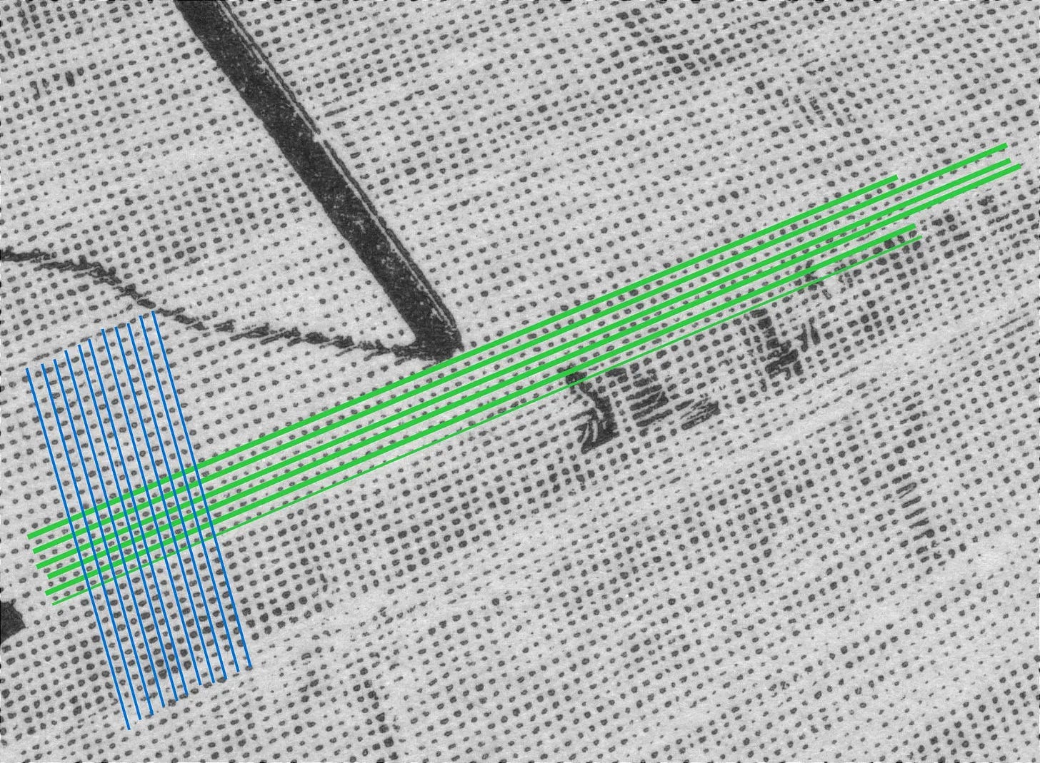
When I look at the engraving, what stands out most to me is the series of repeated lines drawn inside the groove channel between me and the mid-ground, they create a kind of cartoon barricade, visual obstacles to a flow of attention along the interior of the channel. Instead of pulling my gaze into the image, the horizontal lines continually interrupt my visual field and pull me to the right, and then up the right side of the groove channel, emphasizing through my scanning gaze the cross-section contour of one of the many increments down the groove demarcated by the cross-section horizonal line.
These tool path lines horizontally inked across this engraving stand in contrast to the trend of the inferred motion path in the photo, marked below in green for the average motion path bearing both in the photo and in the real live site, crossed by red derived from the average tool path/graver lines of ink in the engraving.
In the practice of the discipline of Architecture the floor is a primitive element of spatial structure.
Why do floors matter for the analysis of engravings of glacial striation? It has to do with psychological effect of the directionality of floorboards.
The bottom of the groove channel in this image is structurally similar to the floor of a hallway: narrow width, long length. We can call this a functional floor.
Imagine trying to lay wooden floorboards in this image. If your primary goal was to create visual depth that pulls people through the space with the leading lines of perspective you would lay them lengthwise running from the foreground to the background. This aligns with the Gestalt principle of Continuity and it creates an openness to the space that cognitively encourages engagement with the space. The naive physics of a visual application of the semantic category of embodied cognition called Force Dynamics (Talmy, 2000) would say that running the floorboards in alignment with the path of motion (running them the long way) is correct because it removes the barrier to motion that would result from having the floorboards cross the path of motion (i.e., running them the short way).
Maybe “correct” is the wrong word, maybe it would be better to say that if you did align the floorboards with the intended direction of travel, you would encourage movement through the space. Likewise, if you did not align the floorboards with the intended direction of travel, you would discourage movement through the space. So correctness depends upon your goal.
A.C. Platt’s goal in his original photograph was to show motion along the central corridor of the groove in which he is standing inside of as he takes the picture. We know this because the composition structures the groove so that the visual path recedes into the distance in perspective, and we see that he gives us additional clues in the photograph about scale (which stand in for distance here). Platt would frequently create and use shadows to illustrate real-world information about the site that functioned as a deictic indexical reference scale (something I may address in the future), and this image has his shadow in the foreground as he stands with his camera. Down the length of the groove channel he is photographing his traveling party of six whose diminished scale helps the viewer of the photograph construct depth. The viewer’s gaze is oriented along the channel. And importantly, the group of people at the end of the channel prevent the cross-section of this channel from becoming the focal characteristic of the content of this image. This is not an image describing the cross-section of the groove.
The primary content here is a view along a channel from the immersive participant viewpoint of standing inside that channel, establishing the spectator viewpoint of completing the view at the six people standing in the midground as the secondary content. Also, by looking at Platt’s shadow, his height, and the height of the camera in the shadow, we can estimate the eye level of the camera vis-a-vis the location of the party in the distance. Combined with the leading lines that crest and fall at the start of mid-ground, and knowing their height at their distance the viewer of this image palpably senses the hump inside the groove.
Chamberlin’s goal in using this photograph from Platt was to describe vertically arched striae on vertical plane surfaces, the arch is up and over this hump. We know this because Chamberlin describes the various horizontal arches in the right foreground of the photo:
“The significance which attaches to curved striae lying in an oblique plane is accentuated in some respects, though not in all, by striation on vertically arched surfaces and by vertically arched striae on vertical plane surfaces, both of which are well illustrated in the accompanying figure, likewise from the great central groove of Kelley’s (sic) island, in which there are at the same time less notable exhibitions of horizontally curved grooves in the right foreground (Fig. 14).” Chamberlin, 1888, pp177-178
We also know that Chamberlin thought the image was adequate, as he mentions his point was “well illustrated” by the figure. This confuses me because my initial reaction to the engraving of this image was revulsion.
As I mentioned, I own an original print that Platt made of his photograph, and before I had even seen the engraving I had closely studied the photo and looked at it more times than I can count, so I came in with a deep familiarity with what is happening in the image. Furthermore, I have actually been inside the remaining glacial grooves on Kelleys Island and I know the logic of the space, the scale, and how it presents as a structure in real life and in photographic documentation. Chamberlin had the benefit of both of these experiences, too, but the engraver only had the experience of working from the photograph, which I believe makes a difference.
My initial (and lingering) revulsion came from the fact that the graver tool path discourages visual movement through the space because the graver tool path described motion that ran perpendicular to the movement of the ice through the geologic scene. The engraver ran the floorboards the short way through the hallway instead of running them lengthwise, and so the most important thing Platt was trying to capture in his image was lost in Chamberlin’s engraver’s rendition of the photo.
While the engraver did use voids and negative space to communicate forward motion down the channel of the groove from foreground to midground, the tool path moved from right to left, which in my reading accentuates what Chamberlin described as “less notable exhibitions of horizontally curved grooves in the right foreground.”
This engraving better described the horizontal curvature of the scene (the cross section) which was secondary to Chamberlin’s goal, and the engraver defined the vertically arched surface through negative space instead of positive space, which would have better emphasized the veridical directionality of the original agent that formed the landscape itself, namely, the Glacier. As it stands, the engraving violates Talmy’s notion of barrier removal to the visual field, which unfolds into a host of ways this engraving violates embodied experience of a space resulting in what I would consider an inadequate image for representing the real world as data and as scene-setting.
The published engraving employs many techniques in establishing depth, primarily the build up of the long leading lines by removing material from the printing plate to subtract the ink.
The long leading lines in the engraving are produced by removing material on the printing plate so that it does not carry ink in the spot where the line is supposed to emerge. The result is the areas of the image that lack the marks of ink form the suggested leading lines (achieved by way of the Gestalt principle of Completion or Closure, which then results in activation of the principle of Emergence).
This use of suggested leading lines produced through voided areas is similar to the way that highlighting and toning were achieved in image pairs 1 and 2.
As I mentioned earlier, this image violates the Gestalt principle of Continuity through the infidelity between the tool path of the graver and the abrasion path of the glacier, considering the engravers produced lines that are perpendicular to the actual path of motion. Yes, they produced suggested lines through the build up of negative space (highlighted in yellow in the image above), but the linear channel of the groove was suggested through a stack of cross-sections that move from foreground to midground in the image (shown in red lines crossing the horizontal plane), instead of relying on graver tool paths that could have been used to cut lines that co-extend along the thalweg of the channel of the groove (as seen with blue arrows).
The comparison here is between the marriage of form and function, and had the engraver made the engraving tool path actually co-extend along with the glacial path, then in my discourse reading of the set of images as images that stand in for data vs images that illustrate and establish scenery, the idea of the medium being the message could have enhanced the value of the image by turning it into a data-bearing image instead of merely performing as a rendering of scenery.
But as it is, with the tool path being perpendicular to the glacial motion path (red lines), the medium introduces the psychological message of a linear barrier to motion, limiting visual access by a stacked series of blocking lines (as opposed to leading lines). These horizontal lines that run perpendicular to past glacial motion now hinder the saccade of the eye along the actual path of motion.
The viewer is compelled to process the cross-sections building up the length of the channel, rather than having the length of the channel be reinforced through the use of graver tool path cuts that accord with the trajectory of motion, thus being more psychologically valid (based on Gestalt Continuity).
While not in the range of this present study, if my thesis is correct, then creating a new version of this engraving where the tool lines faithfully trace the glacial motion would provide a better stimulus for evoking descriptions of the scene that use Fictive Motion (the use of motion verb to describe a static scene, by some accounts revealing the motion of attention as the viewer processes the visual scene), than would the original engraving which blocks visual motion with the horizontal lines that run perpendicular to motion.
Regarding a reading of the medium being the message here, it would be easy to assume that the medium is the imprint of the engraving, or the medium being the illustration as a communication object, or the medium being the etching plate that was used to produce the image, but it is not any of those in general. The medium in a scientific illustration like this is the directional grammar imposed by the engraving technique. It’s meant to depict that directional grammar, so it might as well produce that depiction by embodying that same directional grammar. I have a feeling Chamberlin would agree on this point.
Because the engraver relies on cross-hatching to model relief, texture substitutes for vector here, disqualifying this image from communicating directional data. Volume replaces dynamics because the use of orthogonal lines places the focus on cross-sectioning the channel rather than leading the eye along the path of motion. Surface replaces process because the perpendicular lines define the surface texture at the expense of emphasizing the glacial motion. These decisions comprise the medium making this engraving translation of a photograph into a mere illustration of the scene rather than what Platt intended his image to be which was a vector to be visually followed to the horizon line to understand the scale.
The engraver’s psychological ontology categorizes this landscape as a static scene. And frankly, at that point in time, with the fact that the theory of continental glaciation had not yet animated this landscape for a popular audience, there is no reason the engraver should have perceived it as a dynamic scene. It is rock, it is solid ground. Contract shop engravers were not geologists, they were not specialists in the domains they depicted. But this default to the static scene ontological category here also reflects the state of knowledge at the time. It is also possible that Chamberlin himself at the time might not have comprehended the elegance of aligning tool path to force path in the imagery, but because of his Dalziel images from the early 1880s, I think it is unlikely.
Chamberlin worked during a transition period when geology was observational, descriptive, and when geography was still partly inherited from picturesque landscape traditions (the engravers most certainly felt that lineage), and scientific illustration conventions were focused on legibility in print reproduction, tonal modeling, and familiar artistic conventions (along with a dose of narrative drama). You could say the engraver was just operating according to the contemporary visual grammar, but I don’t think that is the case, especially since this is one of the only images (out of 50) in Chamberlin’s 1888 report that displays this level of infidelity. That feels like greater than chance. I’m not sure. But where this engraving succeeds is within the scenic-topographic-landscape tradition, and it fails in the process-dynamic understanding of continental glacial dynamics that were still formulating within specialist geology circles. This image was produced by a specialist engraver without specialist glacial or geological awareness, so it’s not a geological-data-grade-specialized image.
Part Six Continued: Directional Analysis of Pair 4
Pair 4 was selected as the sole statistical case study because it isolates primary stroke orientation without interference from the kind of secondary engraving tool path passes used to create toning in Pairs 1-3. This allows directional relationships between the photograph-derived perceptual field and engraving behavior to be evaluated without conflating visual depth cues with process geometry.
I applied two complementary models here:
Model A tests whether the engraver preserved the observed channel direction.
Model B tests whether engraving strokes align with glacial motion itself.
Together, these models distinguish perceptual understanding from execution strategy.
Model A: Channel Direction Preservation Test
In this context, the photograph is treated as a depth-encoded perceptual field in which channel orientation emerges from the interaction of geomorphic gradients and shadow-driven depth cues at multiple spatial scales. The statistical and computational methods used in Model A were Structure Tensor Orientation Analysis with Circular Angular Difference Measurement. Structure tensor analysis estimates the dominant orientation of gradient fields in both the photograph and the engraving. Agreement between dominant orientations was evaluated using circular angular difference (Δθ).
Model A Results
Interpretation
An angular deviation of 3.10° indicates extremely strong directional agreement. Within circular statistics, deviations below ~5° represent near-axis preservation at image scale.
The coherence values reveal the mechanism of translation:
The photograph exhibits low coherence (0.097), reflecting natural abrasion variability, tonal gradients, and multi-directional micro-texture.
The engraving exhibits high coherence (0.683), indicating an imposed and internally consistent stroke field.
The engraving therefore preserves orientation while increasing anisotropy, transforming a noisy natural surface into a clarified directional system.
Model A conclusion:
The engraver accurately preserved the dominant orientation extracted from the photograph’s depth-encoded perceptual field.
Model A operates entirely within a shared perceptual field derived from the photographic representation, whereas Model B evaluates the engraving against an externalized physical process axis reconstructed from known glacial motion.
Model B: Glacial Flow Alignment Benchmark
Model B takes the raw photo (annotated to indicate the trajectory of glacial motion) and the engraving and tests the physical process alignment. The statistical and computational methods used in Model B were Circular Orientation Benchmarking against reconstructed glacial flow axis, with Perpendicular Deviation Analysis and Circular Dispersion estimation. A fixed glacial abrasion axis was used as an external reference frame.
Model B Results
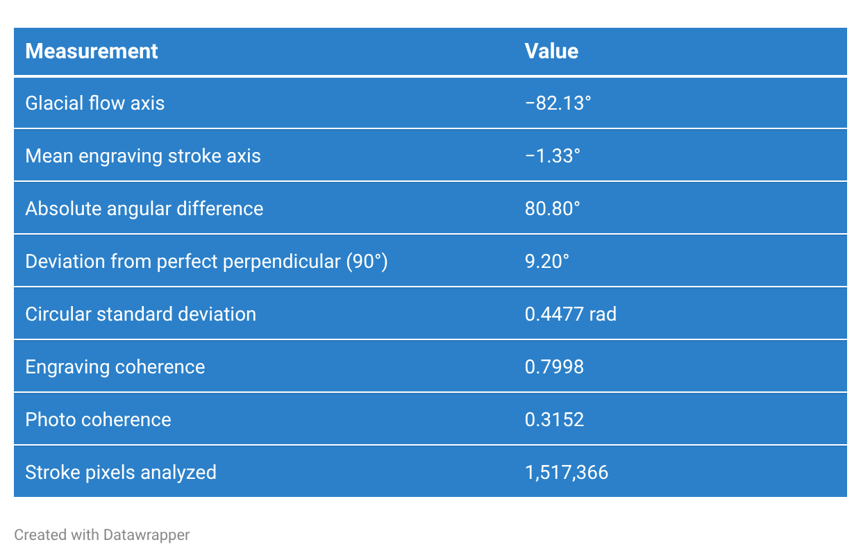
Interpretation
If engraving strokes followed glacial motion, the angular difference would approach 0°, but the actual measured difference of 80.8° places the stroke system close to perpendicular to ice flow. The high engraving coherence (0.7998) demonstrates that this transverse orientation is not incidental noise but a statistically stable directional regime across more than 1.5 million pixels (why I used high DPI source images).
Model B conclusion:
The engraving intentionally organizes strokes across the channel rather than along glacial motion.
A/B Comparative Interpretation
The two models address different hypotheses:
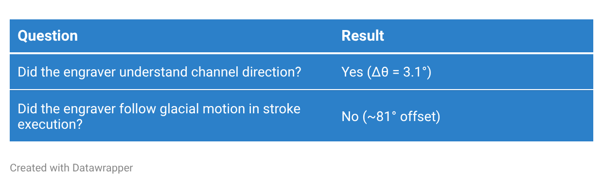
Taken together, the results strongly reduce the likelihood of simple perceptual misalignment within the shared visual field as an explanation.
Model A demonstrates accurate recognition of the groove’s longitudinal structure.
Model B demonstrates a deliberate decision to employ a transverse stroke strategy.
Because Pair 4 contains only primary stroke orientations, this relationship cannot be attributed to secondary engraving passes, stylistic correction, or compositional overworking.
Statistical Synthesis
The engraving reconfigures directional structure across two distinct but coupled representational layers. At the level of image-derived geometry (Model A), structure tensor analysis indicates near-axis preservation of the dominant channel orientation, with a mean angular deviation of approximately 3.1°, demonstrating that the engraver accurately extracted the primary spatial axis embedded within the photograph’s depth-encoded perceptual field, including both geomorphic gradients and shadow-driven depth cues.
At the level of process alignment (Model B), circular orientation benchmarking against reconstructed glacial flow reveals a mean angular separation of approximately 80.8°, indicating a systematic orthogonality between engraving stroke orientation and ice-flow direction.
Under the operational definition adopted here, in which “data-quality representation” is defined as alignment between graver tool-path direction and reconstructed glacial abrasion direction, the engraving does not satisfy this criterion, as reflected in this angular separation.
This divergence is accompanied by a marked increase in directional coherence within the engraving field, reflecting a transformation from a low-coherence natural abrasion structure into a high-coherence, single-axis stroke system. Interpreted through Talmy’s force-dynamic framework, this pattern does not describe a disruption of attentional processes, but rather a reconfiguration of directional constraints governing perceptual traversal: structural “force relations” are redirected from longitudinal continuity along the channel to transverse articulation across it.
The result is a shift in representational emphasis from co-extensive within-channel, or along-channel motion to cross-sectional organization, in which the groove is stabilized as a field of constrained directional opposition (when it should have been a trajectory of attentional flow in the composition). This reorientation structures viewer interpretation in both Chamberlin’s 1888 context and contemporary readings, in that it redirects interpretive attention away from longitudinal flow—the primary explanatory variable in Chamberlin’s geomorphic description—toward cross-sectional structure, which is critically not motivated in Chamberlin’s description that the image is intended to represent.
Statistical Conclusion
Pair 4 provides convergent quantitative evidence that the engraving is neither a mechanical copy nor a misreading of glacial movement. The engraver demonstrably understood the direction of the channel yet intentionally organized marks perpendicular to ice flow, emphasizing cross-sectional form rather than longitudinal motion. The statistical agreement between Models A and B supports interpretation of the engraving as an informed and deliberate translation of geomorphic structure into engraving practice.
The A/B comparison suggests an additional interpretive possibility. Model A demonstrates that the engraver accurately recognized the longitudinal geometry of the groove, preserving its dominant axis within approximately 3°. Model B, however, shows that the engraving strokes are organized nearly perpendicular to reconstructed ice-flow direction. Taken together, these results imply that while the engraver perceived the channel’s structural alignment, the dynamics responsible for its formation may have been interpreted differently, if at all.
In other words, rather than reading the groove as evidence of motion through the channel, the engraving treats it as a form to be articulated across (which I think reflects the engraver’s interpretation of the scene organized around cross-sectional rather than longitudinal structure).
In this sense, the work records accurate spatial observation coupled with an alternative kinematic understanding: the surface is rendered as a transverse structure to be crossed, sectioned, or stabilized, rather than as a path of longitudinal movement. The statistical evidence therefore supports a distinction between recognition of morphological structure and alignment with the underlying process geometry.
I see one generosity I want to recognize here: It might e that the typical experience of geologic stratigraphy typically presents horizons in cross-section, so representing this surface structure groove in cross-section tool-paths might have seemed to a geology-literate engraver as the right path to take, but these grooves occur as the top blanket in the stack of horizons and the surface structure that was important here was transverse along the trough of the groove, so cross-section is still wrong, but I am willing to say it could have been an innocent mistake.
Part 7: The Artist’s Reading
Geological Consequences
If this argument holds, then some historical glacial imagery may need to be reread less as neutral illustrations and more as active mediation, especially around moments of transition between descriptive and experimental approaches. I focused on Chamberlin in this study because he was leading the transition in North America, but many other geologists played a part in contributing evidence.
Many of the engravings from this time period are extraordinarily skilled images, so I’m less concerned about whether or not they are accurate in terms of visual aesthetics. My focus is on whether or not the compositional strategies used in the production of the engravings preserves the directional structure of the glacial process that formed the landscapes being depicted.
Glacial striae are more than textures. Reading the striae recounts the directional records of force, pressure, duration, movement, from which other data can be extrapolated about the unseen ice sheet like size and thickness. But they can also help shape hypotheses about approximations of basal conditions such as whether the debris was frozen solid or moving freely in a socket of meltwater. It’s safe to say that striae encode motion. Since engravings are formed through motion, when they replace directional continuity with conventions optimized for tonal modeling or scenic readability, they partially sever the image from faithfully representing the process that produced the landform.
This matters because nineteenth century glacial geology was still consolidating its evidentiary standards (and Chamberlin’s 1888 text is a significant step toward that formalization). These images circulated as stand-ins for direct observation during the exact historical moment when continental glaciation was becoming legible as a scientific theory, and its credibility was figuratively—but also very much literally—on the rocks. That’s why Chamberlin early in his text enumerates the number of striations recorded across North America so explicitly (2,474) and with what feels like overkill by naming each of the individuals who contribute the records.
The engravings depicting those striae were part of the evidentiary substrate that allowed the science to move forward.
I think this suggests that the history of glacial geology might also contain a history of representational compromise coming from outside of the discipline through the printing conventions that interrupted the geologic continuity. Obviously not enough to invalidate the science, but enough to matter.
Epistemological Consequences
This also reveals something broader about scientific imagery, as I hoped my discussion of adequate imagery hinted at: scientific images re-organize perception through conventions that are influenced by something outside of science.
Every representational system carries operational assumptions inside it. Engraving shops possessed their own professional vision, their own habits of emphasis, ways of handling tricky images, shortcuts to stay profitable, techniques to improve legibility, shading, composition. Those conventions solved problems the engraver and the engraving shop faced, internally. They were not necessarily oriented toward solving perceptual content problems of the glacial evidence they were commissioned to communicate.
Because some engravings fully qualify as data-quality according to the parameters defined in this study, it’s clear these mismatches from source to output were not limitations of capability. Far from it. What is more likely is this was a failure of capacity (under deadline and economic constraints).
At a certain point, any image stops depicting a process and begins depicting the conventions used to render that process in the traces of the hand that produced it.
That substitution is easy to miss because conventions become naturalized through repetition. Then they become codified institutionally. Then they become recognized and expected (objectively trusted) and preferred (aesthetically—similar to the way Instagram has famously changed interior design conventions).
Craft decisions slowly change data into illustration, which is why the distinction matters in my opinion, because sometimes the illustration says something that isn’t fully accurate. To stay in the theme of glaciers, take for instance the trope of a glacier calving becoming shorthand for climate change while ignoring the naturalness of the act of glacial calving occurring even during times of climate stability. The trope ascribes causation indiscriminately and the viewers form the association that the trope is explained by the asserted cause implied by the association. It’s a useful trope, but it stretches the truth a little. That might be reasonable in marketing, but it’s not reasonable in the formalization of theory.
Data-quality imagery preserves operational relationships. Illustration can disrupt those relationships (or abandon them altogether) while still appearing convincing to the eye. One is coherent in corroborated evidence, while the other is a perspective on that evidence without regard to how all of the exigencies formulate the corroborative context so coherence is allowed to slip.
Bottom line, I believe the engravings that succeed in Chamberlin’s report succeed because they preserve process continuity between glacier, stone, photographer, graver, plate, print, and viewer; they reward fidelity between tool and force by embodying accuracy. On the other hand, the failures occur where that continuity is interrupted by inherited pictorial conventions which work in most contexts, but not in the development of scientific reasoning.
Artistic Consequences
This is also why an artist had to do this work. I’m talking about me.
A disciplinary reading of these images would likely separate geology, printmaking, visual cognition, media history, phenomenology, and studio practice into distinct categories of expertise. But the images themselves overlap those domain boundaries, so any singular disciplinary reading is going to overly simplify the problem presented in the imagery.
Artists routinely work across domains because studio practice depends on sensitivity to discontinuity. Artists are adept at identifying moments where material behavior, perception, process, and representation fail to align cleanly with one another.
Specialists often normalize the conventions internal to their own fields (artists included), because those conventions enable work to proceed efficiently (or legibly to their community of peers). But artists can break the rules and get away with it. For instance, for as long as I have been an artist the conventional wisdom for artists was to avoid writing too much about their work. That would never work for me because I use writing as part of the process of opening up the thing I am trying to understand. By writing about it, I slow down my perception to a speed that allows me to notice where the systems break coherence.
That’s what happened here.
This investigation did not emerge from geology alone, or printmaking alone, or image theory alone. It emerged from my curiosity about why I hated an image in a book I read, because that image contradicted what I’ve come to learn from spending years thinking about marks, surfaces, mark making practices, force trajectories, reproduction systems, and the relationship between physical process and visual representation in the formulation of theory about the natural world.
It also emerged from a larger ongoing effort to understand glaciers without ever having seen one firsthand (which has been difficult by the way; I’ve intentionally avoided them during a residency in the Swiss Alps, and during a stint working at a mountain camp in the Rockies). Much of my work over the last several years has indirectly circled that condition of not having seen a glacier: trying to reconstruct the reality of continental ice through traces, archives, photographs, engravings, models, specimens, and the landscapes altered by glacial movement (and the abundance of materials left behind) long after the ice itself had disappeared. That ongoing body of work, An Attempt to Understand a Glacier Without Ever Having Seen One, forms and is forming my archive through the Center for Art + Environment at the Nevada Museum of Art.
In that sense, this entire investigation began with a simple studio question:
What kind of mark does a glacier make?
And what happens when another marking system attempts to describe it?
RYAN DEWEY
Note: I’ll return to this line of inquiry to investigate the material and process overlaps between glaciers and the plastic arts in a treatment on how glaciers make objects.


